Making Roadline—designing a font

How do you make a working font from some type on a road? Our collaboration with Glasgow roadliners was an amazing experience but as ever there is more to it than meets the eye. We thought we’d share a bit of insight into the process of crafting a typeface—and a few of the bumps and turns along the way.
As a studio, we’d long been obsessed with the quirky typographic characters populating the UK’s roads. It was an obvious direction to head in for a re-brand. To begin research, we took some shots.

Lots of shots.

We also began to explore what gives the UK road type its unified and distinctive look. UK roadliners are essentially executing a brand system—the amazing UK roads guidelines created by design champions Margaret Calvert & Jack Kinneir.

Margaret Calvert (Courtesy The Independent)

Margaret Calvert’s typographic work
We’re big fans of Margaret. The supporting typeface we chose—what you’re reading in this post—is also her work and is called New Rail.

But back to the main road. Just like any good typeface, there are some basic rules at work here. The height and width of characters depend on things like speed limit for the road—and has got to be done to the spec in the guidelines. 1.5m high for 30mph, 2m for 40mph, etc. Over the years, professional roadliners have these rules so engrained into their workflow they can mark out the measurements freehand.

The stroke width is mostly set by the paint tool they use .

And then—this is where the magic happens—the letters are each drawn by hand. Every one ends up with a life of its own, all quirks and character.
At this point we could have taken a bit of a shortcut. We could have just used the photographs we’d gathered and patched together a typeface, but we believe the story behind a design injects life into the work on a higher level than we might immediately perceive. At the very least, we wanted it to be hand drawn. One option was to do an interpretation rather than an exact replica; inspired by the original but very much its own thing—think Andy Warhol.

We set out to do this as part of Graphic Design Festival Scotland, where we had the opportunity to join a Colophon type workshop. The approach we took at first was to re-create the tool that roadliners use on the roads and hand draw it ourselves.


The resulting typeface does have a lovely character to it, but lacks a lot of the detail and charm that the texture of real roadline type brings.
We decided the only way to do it was to do it right, and get the roadliners to draw the whole alphabet somewhere. Great idea—although organising it was another matter. After a whole lot of watching paint dry and banging our heads on the proverbial tarmac, we worked things out with a company called Markon. They have a site up at Glenboig where roadliners train, and there they cut us loose with a crew for a day.

Tam and his roadlining partner John, who are usually kicking it around Glasgow, drew us a full alphabet along with numerals and punctuation—they even let us have a go.

As we might have mentioned once or twice, we documented the process with help from filmmakers Pretend Lovers and were able to catch drone footage thanks to Wav Lab. Much more of that here and there.

Once we had photos of all the letters, numerals and punctuation, it was screen time. We imported all the shots, corrected for lens adjustment and scrubbed all the extra details we didn’t want.

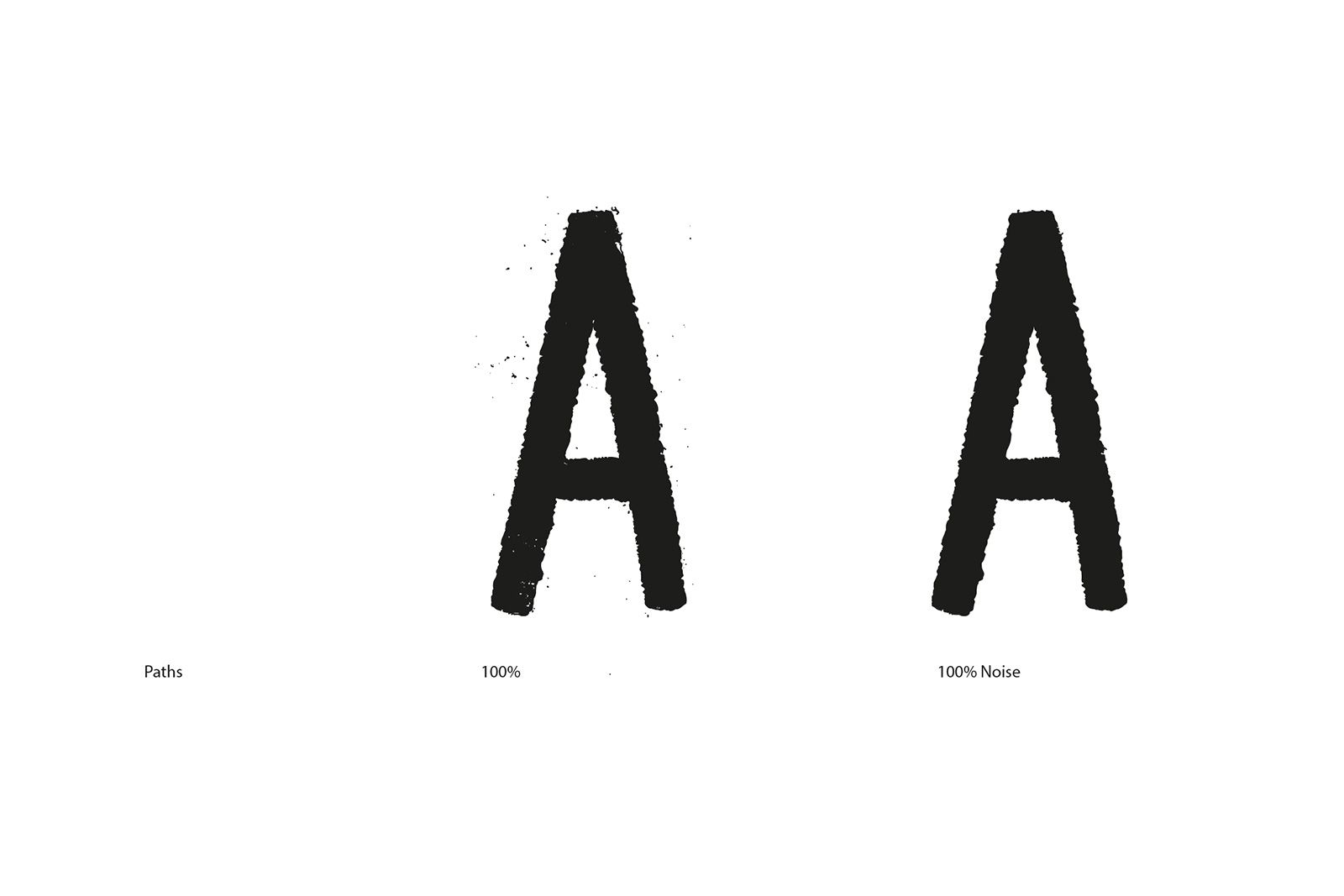
We started to digitise the font to vector, however, we liked the detail—like the lovely radial lines on this ‘8’. Unique characteristics such as this would have impossible to replicate any other way.

Design with this kind of texture often gets labelled with the derisory ‘grunge’ label. Many a swiss-font-packing-rational-modernist would drop their pantone coffee mug at the slightest possibility of ‘adding texture’ to a font.
We’ve found that it’s actually very difficult to design a good ‘grunge’ font. The software just doesn’t cope that well.

For example, here’s an ‘A’ drawn for us by Tam. Digitised to vector, it has literally tens of thousands of points. Eventually it was really just a case of balance, and a lot of trial and error. Overly simplifying it would betray the nature of the type, but too much detail would mean a slower-loading and less functional font.

Some people stop at having a vector version of a typeface, which is okay for very limited headline use. However, we wanted a fully functioning font for print and web. To make it happen, we turned to software called Glyphs. If anyone is thinking of making a typeface, we’d highly recommend it. You can setup each character in illustrator and then paste it into the right position. More here on how to do that.


Thankfully with our font just being an upper-case only headline font, we only had a few characters to set the spacing and kerning on.

As with the rest of the project, there were no shortcuts here. We tried to match it as closely as we could to the spacing on the roads, albeit designed for different sizes. Each letter still had to be carefully looked at in relation to every other letter.
Another final thing we did to try and keep some of the kind of character you get on the roads is to have alternate characters. So the font is programmed to rotate characters in sequence as you type.

In the end, here’s three things we hope you take away about designing a typeface:
- Go for it.
If you’ve got half a typeface designed in illustrator, try glyphs and get stuck in. - Collaborate.
Something we do a lot at O Street. People are good. And the people we worked with on this are amazing. - No shortcuts.
We might have spent half the time we actually did on this project. Or been half as ambitious. But it would probably only be half as good.