Iceland, accidental design mecca
Since branching out to America, a certain island has become an obvious stopping point for Oventurers: Iceland. Yes, we too fall prey to travel blog fever, not to mention the extended layovers offered by airlines at no extra cost.
Iceland is no stranger to quality design, but we find inspiration in the low-brow, everyday graphics taking centre stage amidst stunning landscapes. Here’s a few of our favourites.
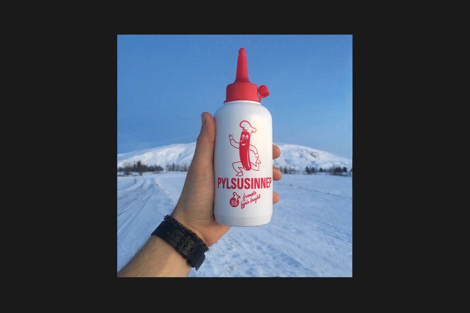
Hotdog Sauce Packaging
If you’re traveling in Iceland on a budget, there’s precisely one thing you can afford to eat out: hotdogs. They’re not glamorous, but they sure are tasty. Fortunately, they’re smothered in this amazing sauce, which comes in an even more amazing bottle. You’ll be clearing space in your carry-on for this smiling dog.
The Swimming Guy Sign
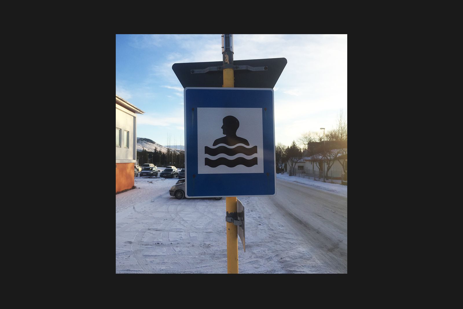
Whether in natural hot springs or a public pool, the hearty folk of Iceland enjoy a soak. So much so there’s signs about indicating where you might find some hospitable water. Pools are marked by this simple icon, which one could also decide to read as a man wrapped in giant bacon strips. Delicious.
Mountain Signage
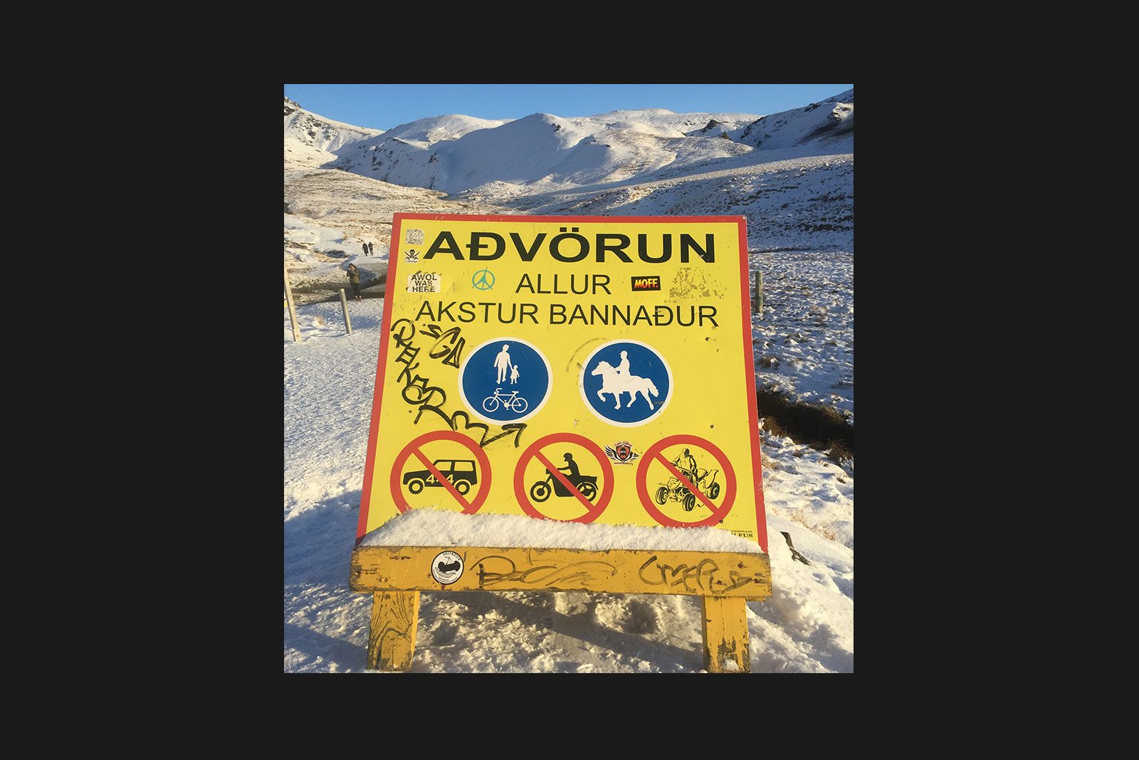
If you’re in Iceland, you’re headed to the mountains. If you’re headed to the mountains, you’re relying on these signs to help you get around. They’ve developed their own amazing visual vernacular over the years, with primary colours, interesting icon illustrations, and local graffiti, er, input.
Brennivín
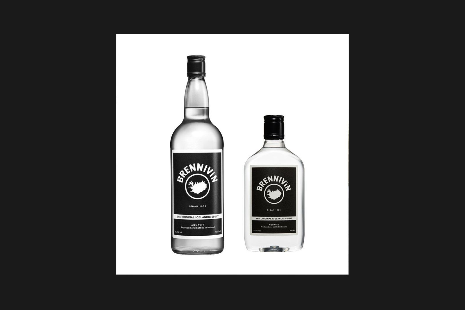
No matter the occasion, if the Icelanders are drinking (they are), it’s this. This potent schnapps will knock your socks off. In an effort to make it less appealing, the government forced the spirit to use black, boring packaging. Predictably, the brutalist design helped sales boom.
Boring old road signs
Signage in the UK is the stuff of design legend, but sometimes the snow is whiter on the other side. The utter simplicity of Iceland’s signs had us wondering if we could smuggle one or two back through customs.
Our Wee Peeing Man
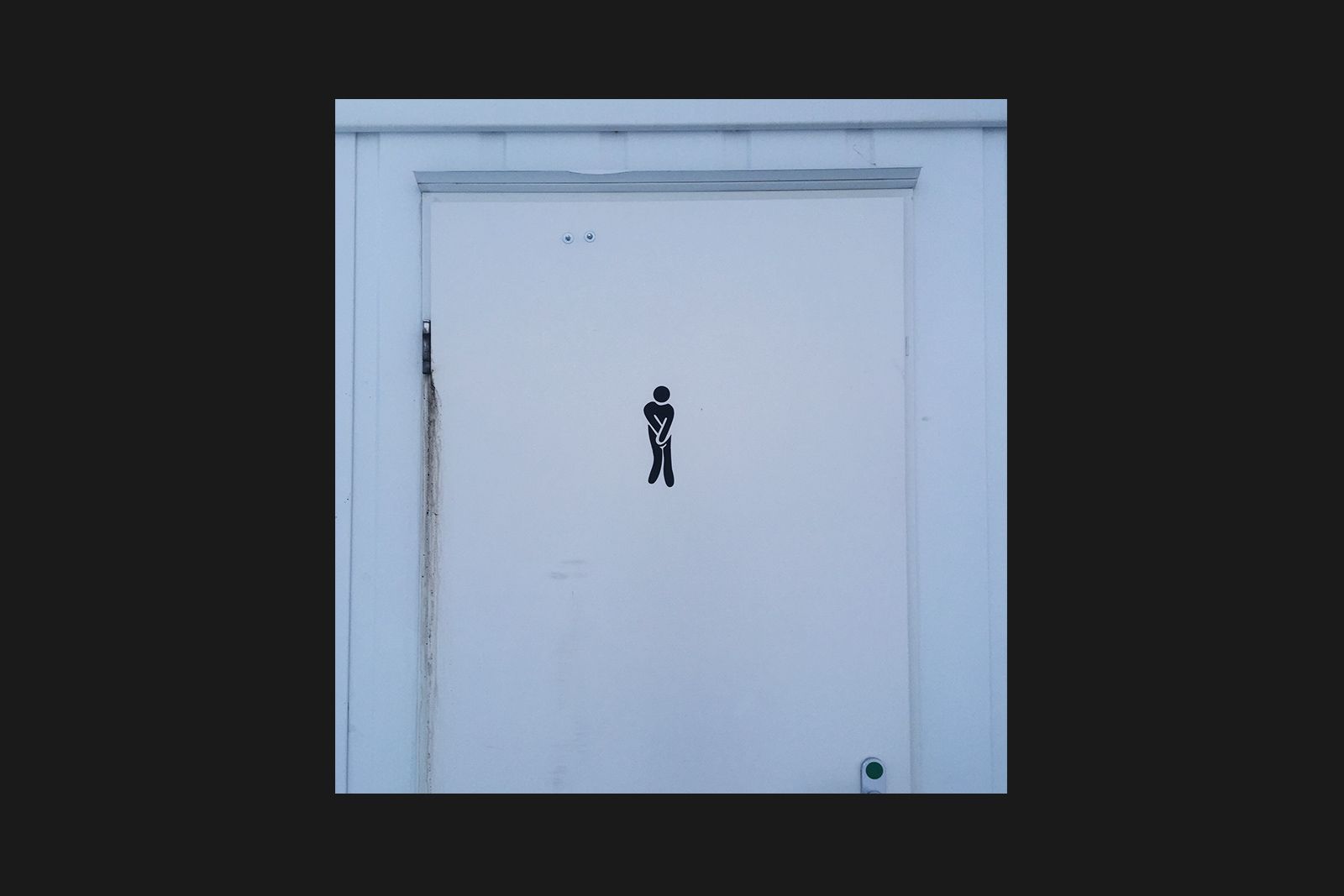
An O Street list wouldn’t be complete without an appearance from our most-plagiarised work: the ‘desperate’ toilet signs we designed for Jamie Oliver restaurants way back when. This time, they’ve appeared at a public toilet at the base of a stunning waterfall some 100km outside of Reykjavik. When you gotta go…