last of the cut ’n’ pasters…
We were out of space in the studio plans chest yet again. Right, some of this shit has to go. And go it does, piece by piece to reveal… eh, what’s this at the back of the drawer?

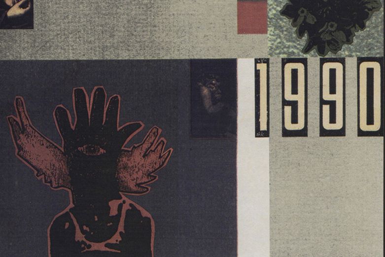
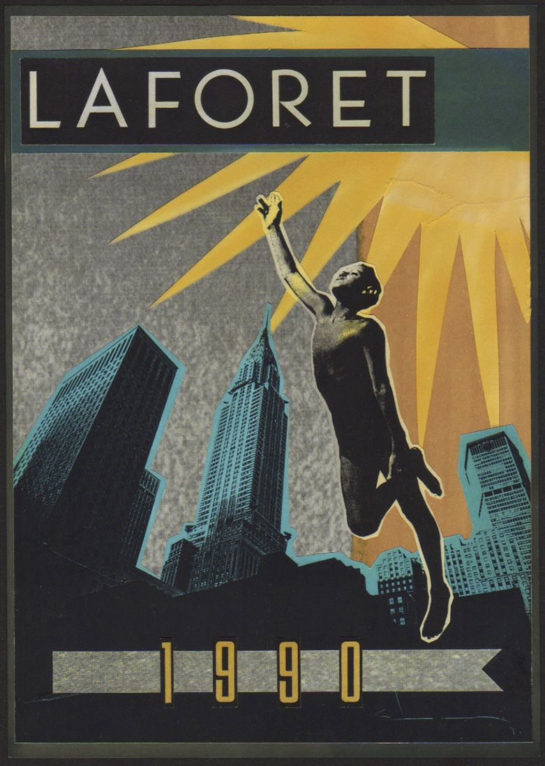
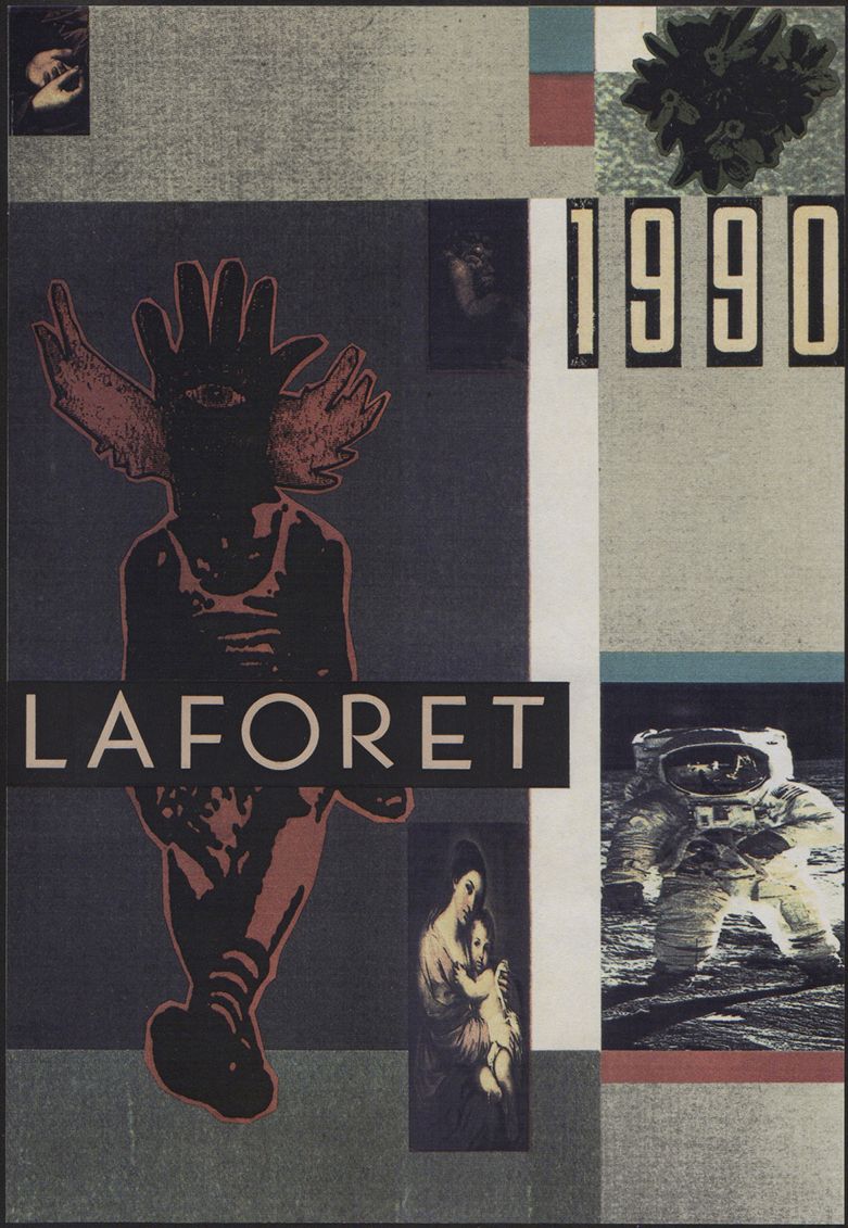
Man almighty, I’d forgotten all about that. A black oversize A4 plastic display book with the word ‘LaForet’ tucked into the clear spine pocket. But it’s all coming back. This remnant from the glory days of cut ’n’ paste. A handmade campaign snapshot presented to Japanese ‘depaato’ (department store) LaForet back in 1990 (a fine example of why it’s a good idea to put the date on things).
‘What’s that?’ says the voice of a person in their 20s, over my shoulder. ‘That,’ I reply, ‘…is 1990’. When I was a person in my 20s. And right there, I saw myself clutching it with sweaty paws as a room-full of perplexed Japanese media execs closed in.
Back then, I was working for Sony Music in Tokyo. A certain Mr K, one of the many sellers and fixers who flitted in and out of our office, had decided that I was his go-to-guy for ‘all things unusual’. It’s odd how far a pair of white brothel creepers will take you in this world. It all seemed highly suspect, but with the tacit approval of the big boss and occasional bribery, Mr K brokered my services to other agencies—in this case the somewhat straight-laced, poker-faced account handlers at McCann Eriksson Hakuhodo.
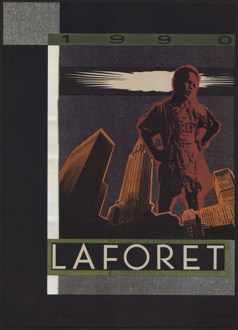
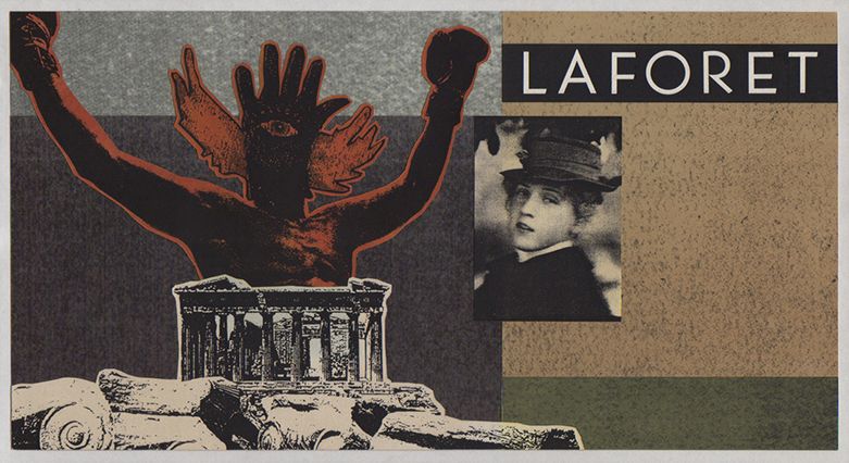
Hence LaForet, a sprawling and vaguely trendy store in the Harajuku shopping district, tapping me up. In retrospect, I only remember their brief stipulating ‘something different’ for an autumn/winter campaign. That was lucky, as my response was to stick a black magic hand over the face of a small boy in his underwear and attempt to sell it in as the lead poster image. Ambitious and dumb in equal measure—friends, I must’ve been on drugs.
Suffice to say, it was a step beyond the step beyond they had imagined (fair enough really) and yours truly didn’t get the gig.
Happily, it did lead the ever resourceful Mr K and I to some sublimely random commissions elsewhere. Note to a younger me: ridicule and lack of remuneration are no barriers to creative expression. Let’s hear it for small children with voodoo heads, everyone!
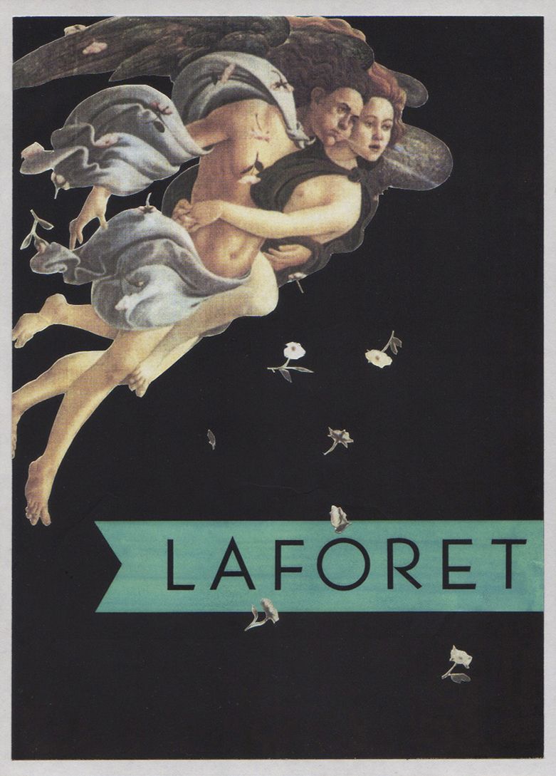
Anyhow, mise en scène apart, the original point of this tale and the thing that person in their 20s was so taken with, was all this visual calamity had been done analogue oldskool. Indeed folks, I am talking magic markers, scalpels and UHU (anyone born after 1985 can use Google or ask an old person to expand on these terms). And yes, all those flowers on the Botticelli above were cut out by hand. The only inkling of design technology to come that played any part was the clunking workhorse Canon photocopier. Once you’d cleared the paper jammed shots of other people’s bottoms, that is.
I suppose it’s pretty quaint now. Back then, working in confined spaces, high on pen, glue and petrol fumes, the risk of brain damage and self immolation never really crossed our minds. After all, we were just doing what we loved, the only way we knew how.
Was the work any better because it was harder to pull off—I doubt it. But it does make me smile and just a wee bit nostalgic for those days of chemical and physical endeavour.
So come on kids, park that mouse and flip your switch for the solvents.
ONW
. . . .
LOTCNP is, conveniently for these purposes, a track by moo-wave popsters Joaquina, from the album ‘The Foam and the Mesh’. If you like that kinda thang—and really, you should—you can check it out here or just go straight and blow 99¢ at that Amazon.
. . . .