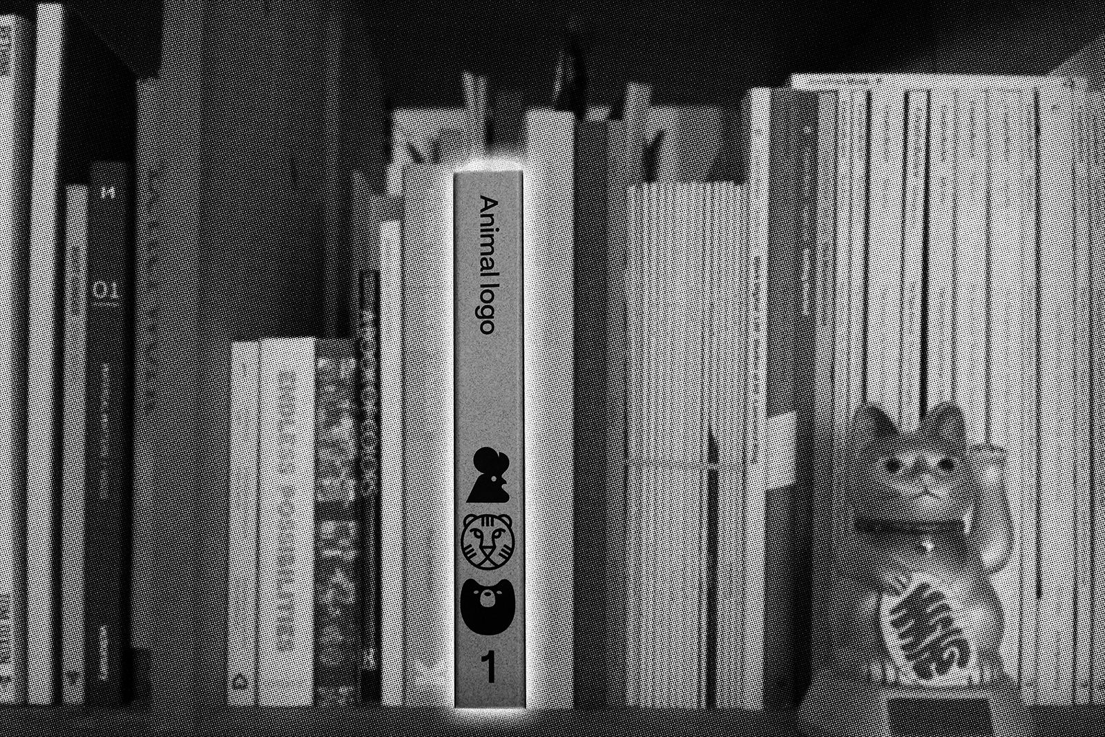
Craft (Your) Beer (Brand)
In years gone by, when I was a student at art school, the choice of beer in the union bar was poor: Lager, Heavy or Guinness. Or, if you were a fancy pants, you might be lucky enough to get a can of Red Stripe. There has been a revolution in the beer scene since those days. Walk in to any bar or bottleshop today and the choice is overwhelming, from the vast number of breweries now making beers, to the wide range of styles available.

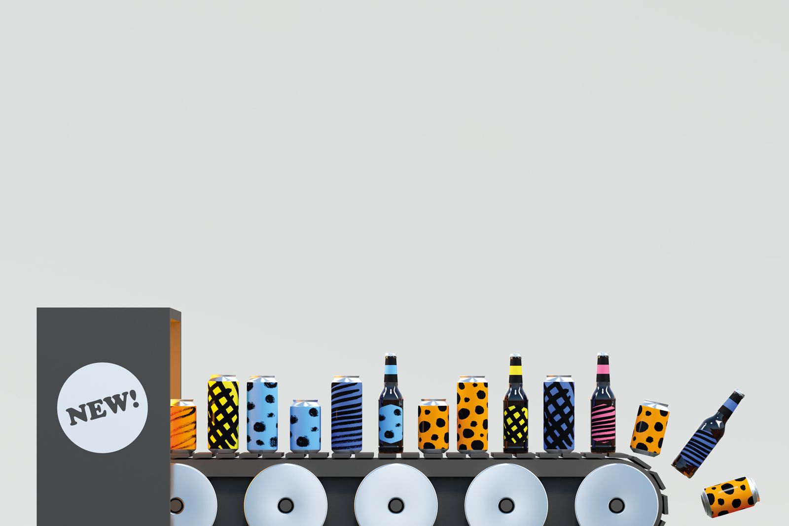
Good design is key to helping the modern consumer navigate those said bottleshop shelves and taproom lineups. New challenges are cropping up for breweries that were once able to guarantee sales on beer quality alone. Here are a few basic lessons we have learned over the years:
Build trust and recognition in your core brand.
Consumers trust a brewery like they used to trust a record label or publisher. Once you realise that a certain brewery makes tasty beer, you’re obviously going to be comfortable choosing one of their other beers. Help the consumer recognise your brewery by reflecting your overall brand in every can.
Stand out from the rest.
Look at what all the other beers on the shelf look like and do the opposite! There are only so many ways you can copy Beavertown before everyone looks the same. It’s common sense; by making your design different you will make it easier for the consumer to notice you.
Be authentic.
The days of brands hoodwinking consumers with made up back-stories was over in the 1950’s. Today’s consumers want a brand they can trust and believe in.
Don’t underestimate the visual sophistication of your audience.
Everything is looking more sophisticated year on year; movies, video games, fashion, kebab shops. When your target audience see how cool things can look, they are no longer going to be seduced by a design your best friend’s flatmate’s nephew has knocked up on his laptop with a hooky copy of Photoshop.

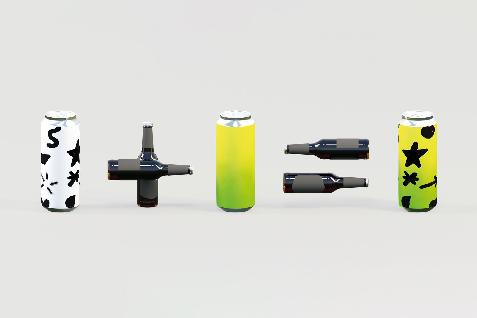
Basic lessons however only equip you to deal with basic challenges. The recent explosion in the beer scene requires breweries to develop designs that move and grow as fast as the choice of beers does. In the early days of craft beer, producing a single ‘craft beer’ was enough. As consumers demanded more variety, a wider selection of core beers was required. A label system designed to fit one beer style needed to be stretched to fit a wider selection. In Scotland, we saw Innis & Gunn’s original red label, being used in blue to differentiate their Rum Cask variation. Breweries with a wider range of core beers, like Brewdog, required a much wider colour palette to accommodate all their beers. But, how many colours can you add to your palette before customers confuse the ochre of your lager with the burnt orange of your pilsner?
A cherished brand in the design industry is Brooklyn Brewery. The brand and basis of the labels was designed by the legendary Milton Glaser, the famous designer behind the ‘I heart NY’ logo. The labels employ combinations of colours that allow them to visually define a much wider range of beers than single colours could. However, even these guys are struggling to come up with new combos to differentiate their beers. We’ve recently noted that in addition to flipping the colours on the label for each beer, they have also introduced different textures. The orange and green of their East IPA is used again on their Orange IPA variation, but it’s in tandem with an orange peel illustration to keep the label distinguishable.
We might assume at this point we have a handle on how to develop a label system that can grow and develop as you do: A strong core brand; bold headline type defining beer style; a colour palette (of single colours or combos); and texture or illustrations to add a further level of differentiation.
Problem solved? Naw, nae really.
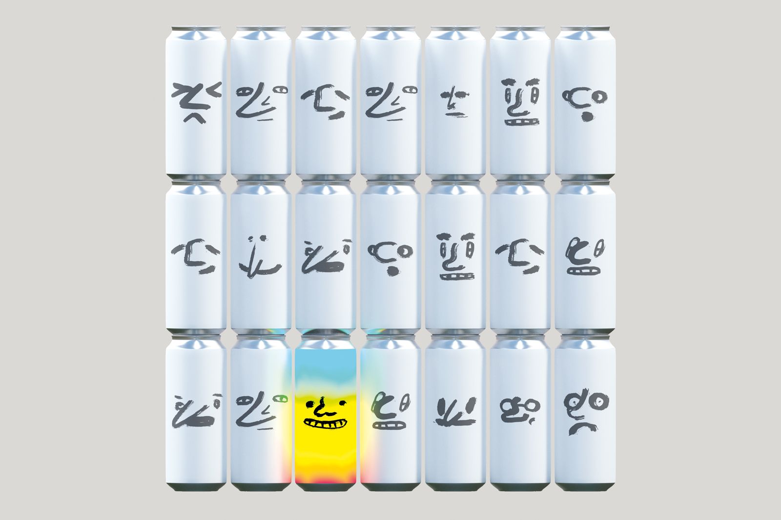
We’ve found new curveballs entering label strategies. Suddenly one-off, seasonal beers are becoming more of a priority for brewers than their core range. This offers a huge amount of variety to consumers, but a real headache to designers. We can handle a slowly growing core range, as you have time to optimise on work on each label design. But with seasonals, new labels are required with much more frequency, and beers can be dropped just as quickly. We have the same challenges of stand-out and differentiation for a label that might only be on the shelves for a few weeks before we need to be ready to develop a new one.
To be honest, when I say it’s the designers’ problem, what I really mean is it is the breweries problem. Most breweries can’t afford to hire external design studios to design every one of their experimental seasonal beers. Instead, we have begun developing label template systems for our clients that, alongside a little training, allow the breweries to design their own labels. These very often have areas where variables can be introduced to differentiate the new beers. We don’t rely wholly on colour but allow multiple ways to personalise a beer whilst still remaining ‘on brand’. We can’t forget that first golden rule of building trust in your core brand. Making labels that look different for the wrong reasons often dilutes your core brand, eroding this trust.
The next curveball (and I am sure not the last) is the recent trend for collaboration brews. Again, brilliant for the consumer, it’s bringing amazing new beers and the best features of our favourite breweries together in delicious harmony (think Johnny Cash and Bob Dylan singing together on Nashville Skyline – David) (think Linkin Park & Jay-Z combining forces on Numb/Encore – Jonny). To tackle this new nightmare for designers we still recommend a template approach, like the seasonals, but this time it includes the added complexity of a second brewery brand (who’s logo and personality often need to be incorporated).
It’s not easy, and we also realise that trying to rationalise a design approach for each new industry fad is not the only solution. Keeping things clean is important both in the design process and the brewing process, but allowing space for creativity, allowing the wild yeast to add some funk, is also a door we must leave open. Some of our favourite label designs break all the rules: the candle stub design for Ominipollo’s Maz pale ale is a modern classic, where colour, brewery and even beer name are all thrown out the window (or round the back).
However, you can’t fight all battles, on all fronts, at the same time. Helping breweries define their priorities at the outset of a project is key. What is your brief? Do you want to develop a label that will make your beers appealing on a supermarket shelf; develop a label that will build loyalty with a local community of superfans; develop a beer label that optimises e-commerce opportunities; make a splash on Instagram; gets rival brewers jealous; make your ex notice you again, etc. etc.
Whatever your priorities are, a good designer can help you get there. We’d recommend your best friend’s flatmate’s nephew, we heard he has Photoshop!
(adapted from our original article featured in the October 2019 edition of Brewers Journal)