Is Logo Design Dead?

A social media post made a splash when designer Mirko Ilic posted an image featuring the vintage logotypes of several famous fashion brands alongside their new logos. His caption simply read, “Interesting logos are being replaced with boring ones. This are the people why are destroying respect for graphic design.”
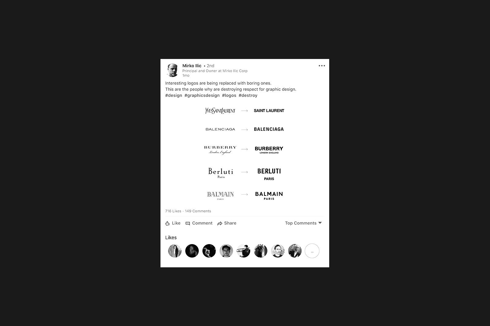
The post immediately caught fire and was soon being debated across the internet and mentioned in industry leading podcasts such as The Observatory. Reactions tend to fall into two camps:
1 The redesigns are legible, in the tradition of Modernism, and that’s dandy.
2 Graphic design is dead.
We’d like to propose a third option:
3 Brands used to set themselves apart with a logo, but now they’re now differentiating themselves in new and interesting ways.
First, a look at the two initial camps. With its roots in Bauhaus universalism, capital-M Modernism—not to be confused with its generalized cousin ‘contemporary’—stresses legibility. In typography, this tends to express itself in simple, geometric sans-serif typefaces. With Modernism, creativity is thrown in the trash in favor of simplicity and straightforward communication. It’s all KISS (Keep It Stupid Simple), a tagline thrown around so much you don’t need to look far to see it in the comments for this debate:

Modernism has its place in design history, but it’s important to remember that it was a specific movement in the arts and advertising. While there are Modernist principles that will live forever, practicing Modernism like it’s 1960 has become an aesthetic; a statement in and of itself. Many of us are just suckers for its legacy, look, and feel. Some days I’m one of them.
But we have this other camp to contend with: graphic design is DEAD. Burn your black turtleneck and dig your grave.
For many designers, what makes them relevant is their creativity. They’re just as much artists as they are communicators, and graphic design is their opportunity to make a mark on the world. To apply that unique artistry to a brand, and set them apart from their competitors, is the best thing you can do for said brand. Postmodern design took the rigid rules of Modernism and burned them, and in their eyes, for good reason.
Sadly, in these designers’ eyes, brands are embracing cheap Modernist tricks, and buying easy sans serif logos for five bucks. Lazy designers are selling them boring crap, and killing the industry with ‘blanding’.
There’s your two camps.
At O Street we straddle a line between these two theories of practice. Sometimes, you’ve just got to communicate something so nobody shoots their eye out. Break out the Modernism. At other times, we’re itching to dig into our messy art supplies or crazy 3D digital skills, and it’s also the right thing for the client. So, we ride the line between chaos and order. Let’s call it the Design Tao.
What’s most important for us Design Taoists® is asking: “why?”. No matter the brief, the best solution starts with this simple question.
And there’s a big “why” with this logo debate. Something is driving brands to embrace these simple redesigns, so what gives? This brings us to our theory, or third camp: as brand touch-points get more interesting, logos simply hold less weight.
During the age of Modernism, all brands pretty much had the same ways of reaching their audiences. It was the quintessential ‘brand’:
– Business cards
– Letterhead
– Print advertising, and later television advertising
– Interior design
Today, it’s probably more like:
– Handheld video content
– Personal social media engagement
– Five second Youtube ads before someone hits ‘skip’
– Spacial design, specific to events and ‘happenings’ for maximum impact
Now, obviously people and brands still hand out business cards now and then, and it’s wise to have a card that’s considered and well made (call us if you want one!). But the landscape has changed, and the terrain where most engagement happens is totally foreign to the design world of decades past.
Brands have realized that logos are no longer the key identifier of their brand: interactions, digital and personal, now reign supreme. For a modern day brand operating on the world stage, a static and stable—that is, boring—logo may be necessary so that crazy things can happen on the periphery where the engagement is at. For every designer who’s sad they’re not being paid to make crazy logos, there’s a very happy designer out there making crazy motion graphics and video content.
An example from the post that set off this debate is Burberry. Their old logo was elegant and iconic. Their new one? Boring as heck; the unveiling even included incredibly self-aware email screenshots about how quickly it was made.
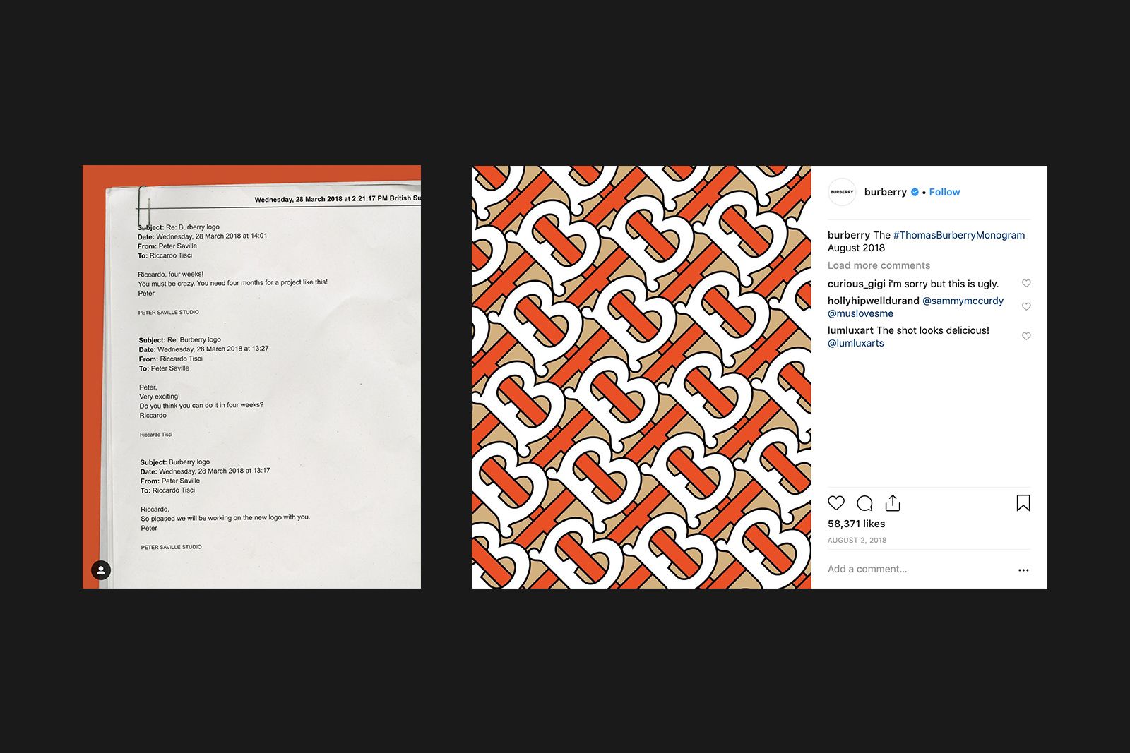
What’s not boring as heck is the accompanying pattern, arguably ugly but certainly not stale. The ways that it will be applied are dynamic, exciting, and interesting. The logo itself? An afterthought.
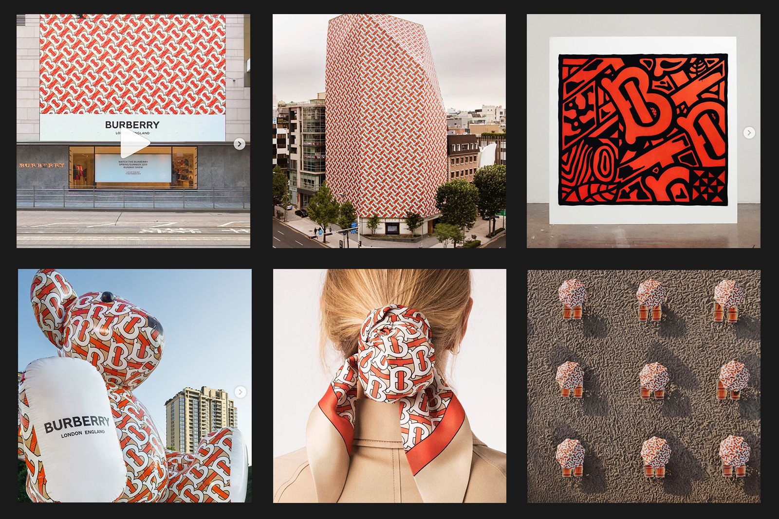
So there’s our third camp argument: logos are just being swept aside for more interesting audience interactions. Of course, we could be wrong. Maybe brands are just skimping on quality design so they can use up their budgets on celebrity Instagram posts.
We’d rather not be wrong, but if we are, you can bet we’ll ask: “why?”