BuildX Studio is a design & build architecture studio with a difference. They needed a new brand to reflect their bold approach and capture the personality of the company and its people.
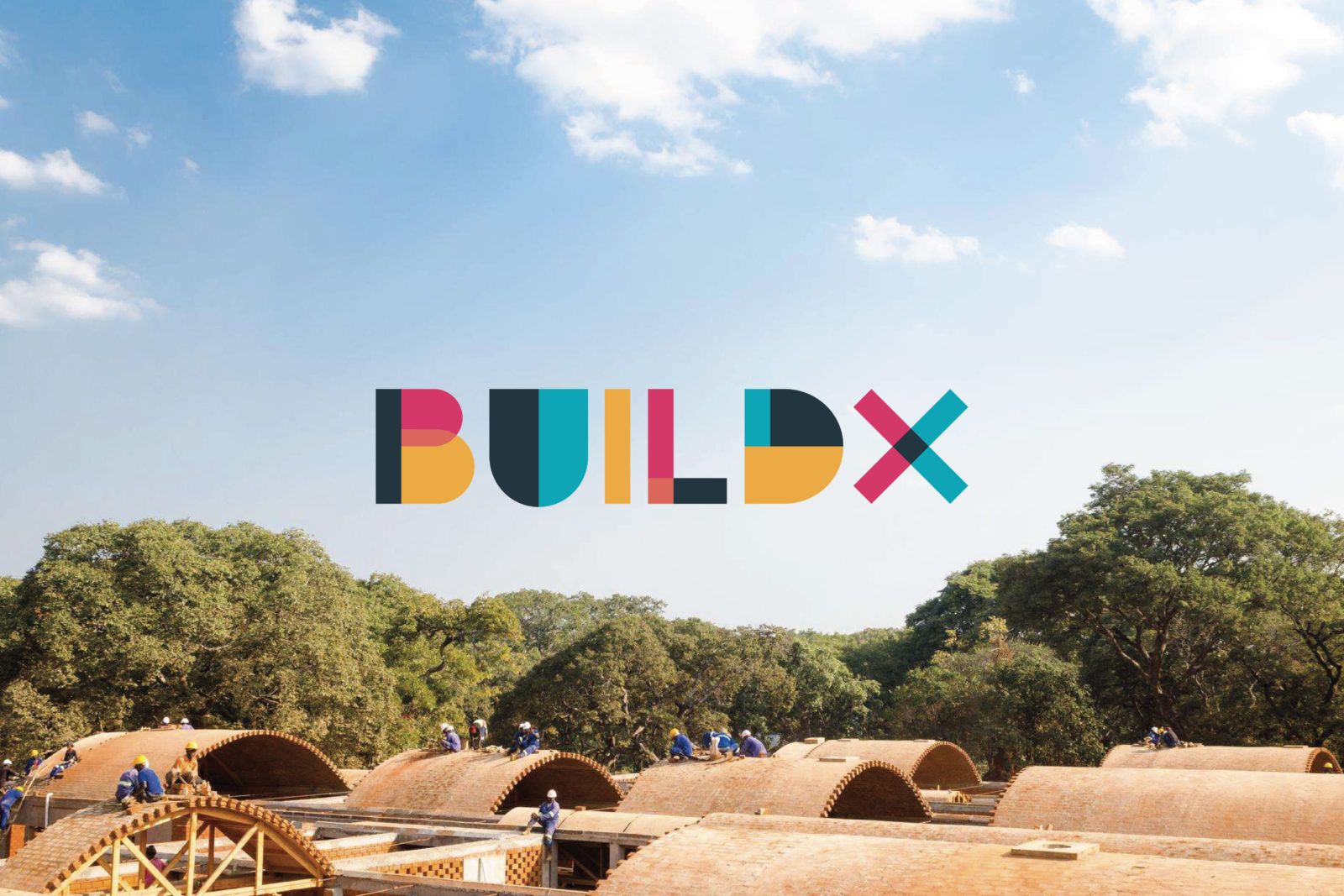
Formerly Orkidstudio, the architecture outfit and their new sister organisation have grown into a disruptive and innovative company. They came to O Street to give them a new visual voice as strong as their ethos.
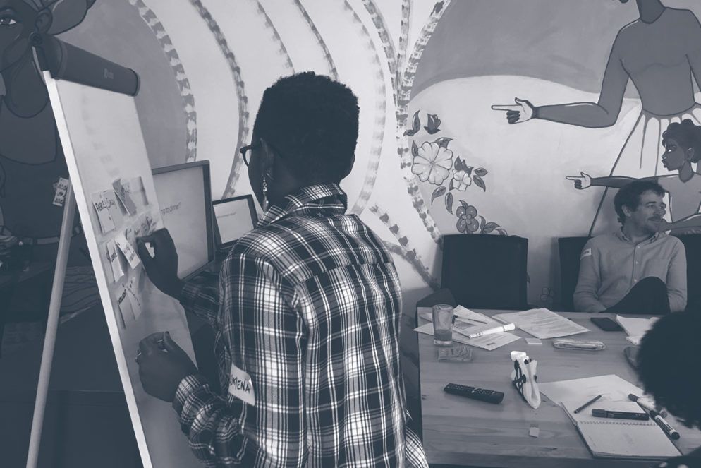
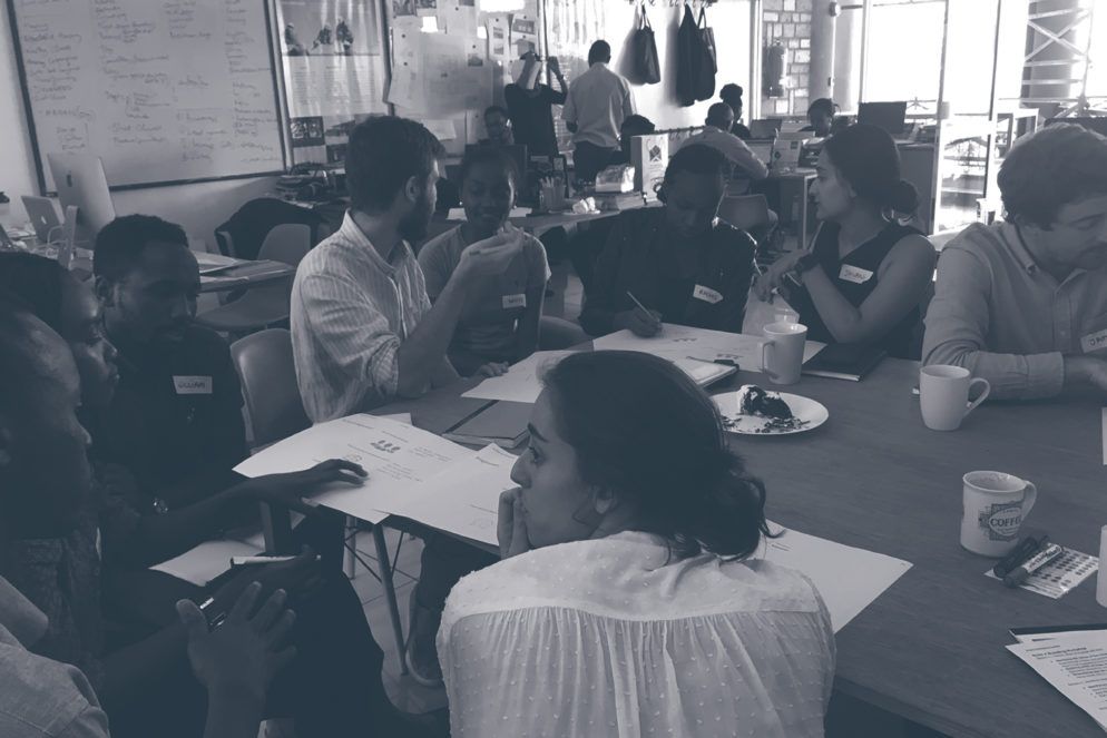
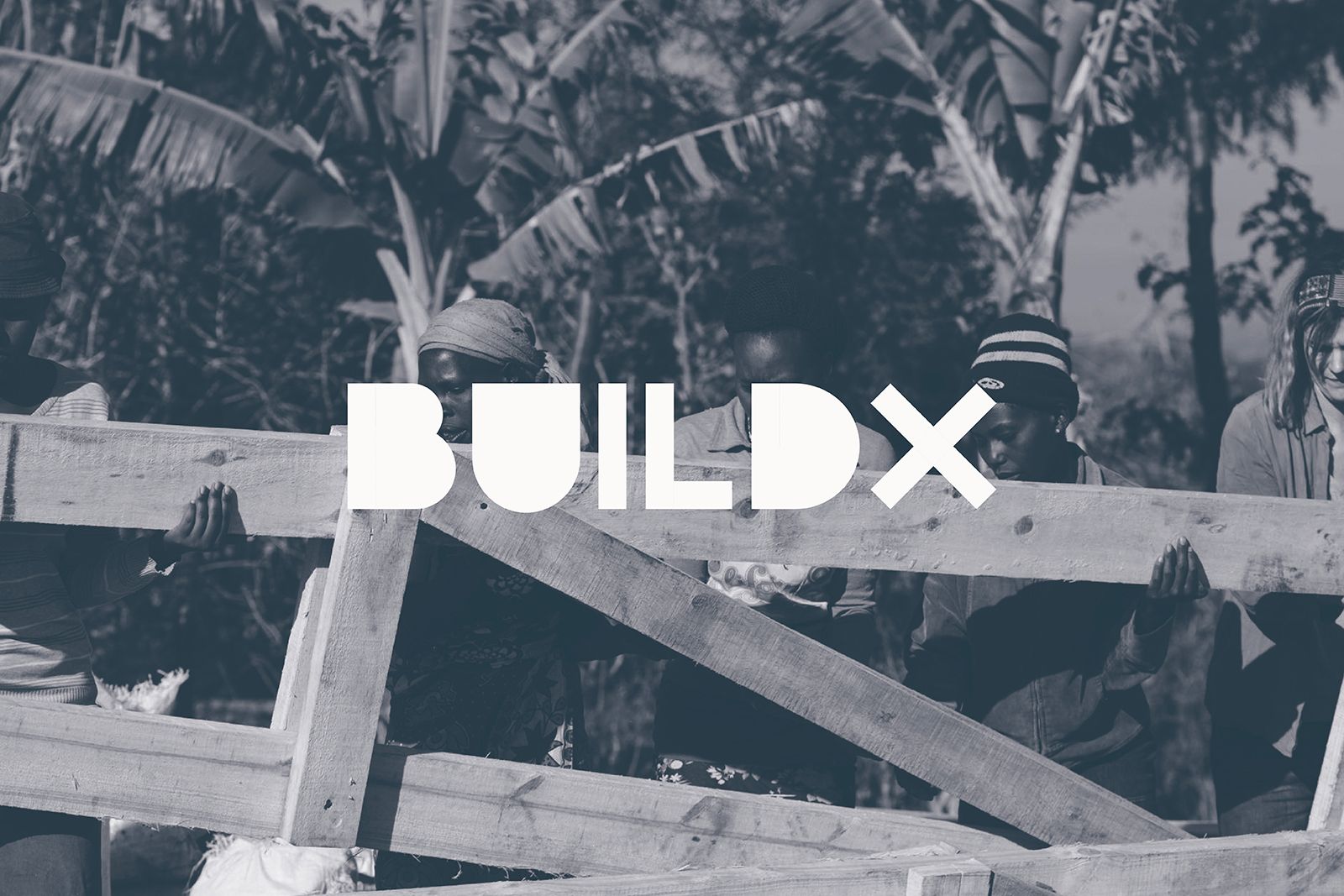
It was important to the BuildX team to meet with the designers working on the project, and we obliged (it’s not everyday you get to see a full workshop of women learning construction skills or kiss a giraffe). The immersive site visit was essential to seeing how the BuildX team and their sister organisation Buildher operate together.

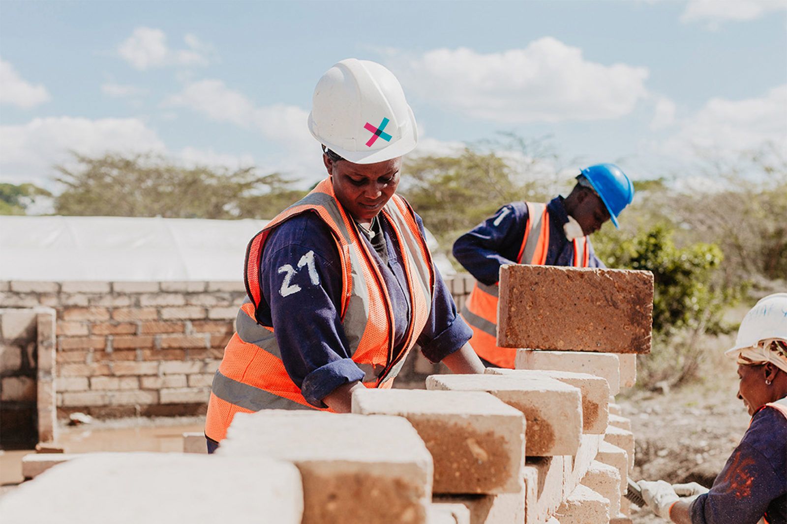
We knew that BuildX wanted to stand out from the crowd. Their projects are all about collaboration and innovation, so we pulled together different geometrics shapes to craft a bespoke logotype of colourful building blocks. The shorthand ‘X’ logo stands our from a distance.


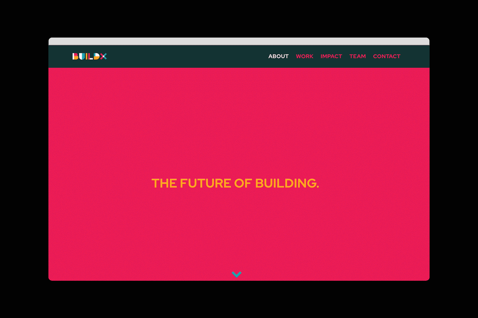
Website design by BuildX Studio
These bright contrasting colours went on to form a key part of the wider identity, being used across different print and screen applications to bring the brand to life. The logo breaks down into individual blocks, forming vibrant patterns or visual infographics.

Buildher focuses on construction skills training for young women, providing opportunity and inspiration through learning and employment. As a sister organisation to BuildX, we wanted to create a complementary logotype with its own confident voice.


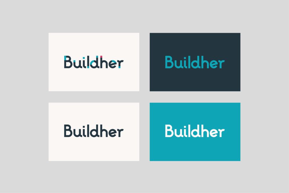

We switched up the expected primary colour use by making blue the primary Buildher colour and reserving pink for BuildX. Our studio created style guides for in-house teams to confidently take the identity we had crafted and get creative with it.

The result is a brand identity that really works for BuildX Studio and Buildher. A disruptive identity in the construction world, it matches the unique approach of these inspiring organisations.
“We are all hugely grateful for your work on this. We love the final logos and identity, and thoroughly enjoyed the process along the way. It was great having you out in Nairobi as well!”
– James Mitchell, Co-Founder and Director


