Nestled in the historic Baker neighborhood, Denver Distillery is the city’s first distillery-pub in town. They had gathered a loyal following but was lacking a strong label system for their extensive range of spirits.
The distillery is known for using exclusively local ingredients to create a wide range of high-quality spirits. After finding that their visual presentation didn’t match their products in quality—prohibiting greater online sales and distribution opportunities—they asked O Street to look at fixing things.
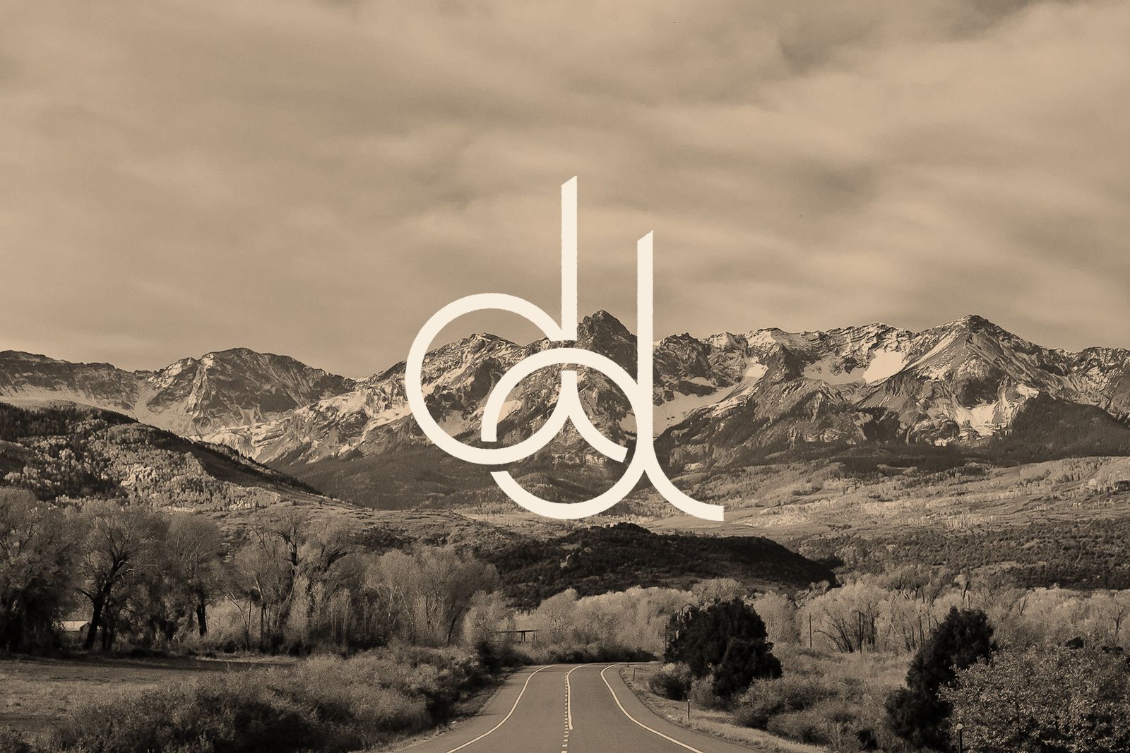
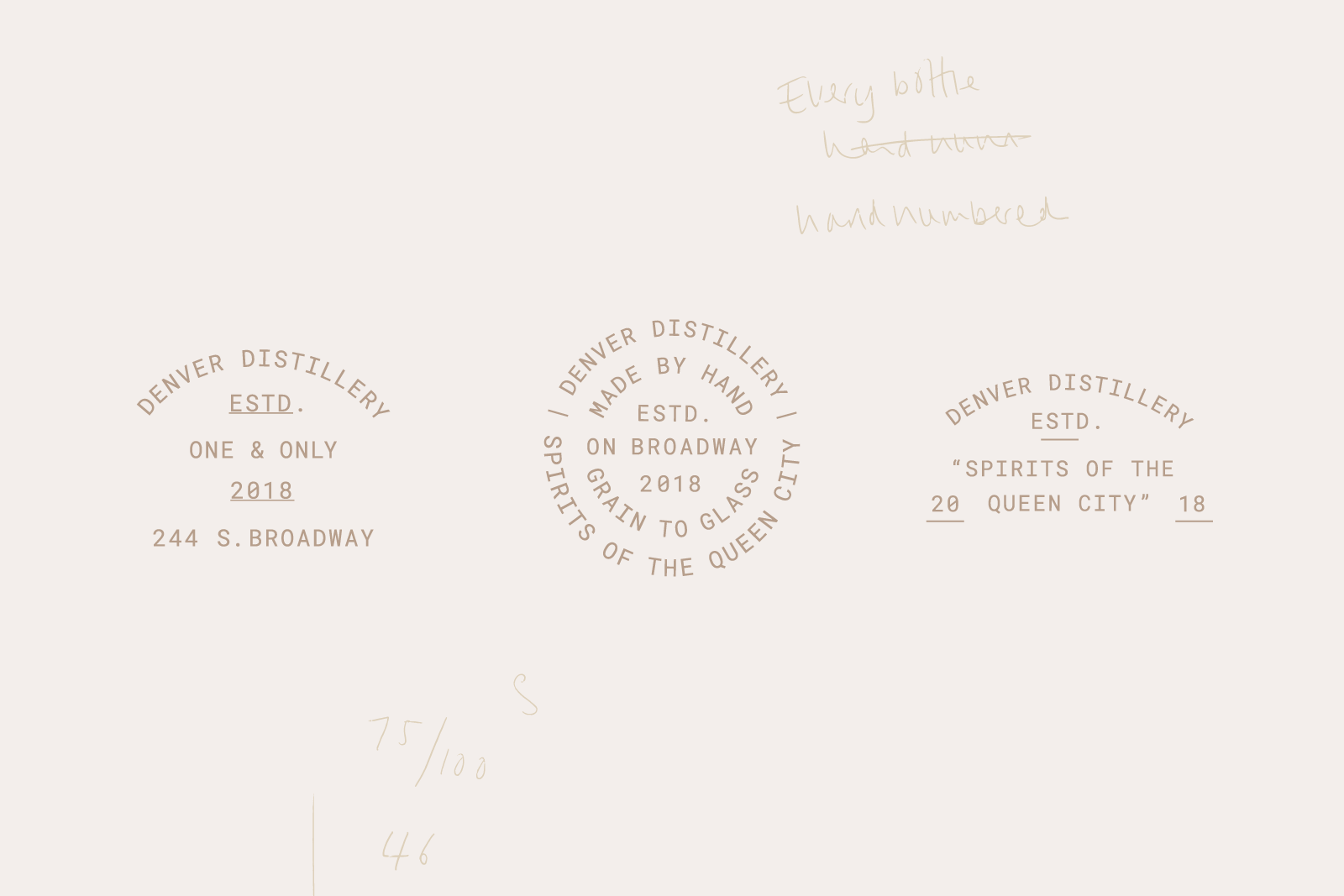
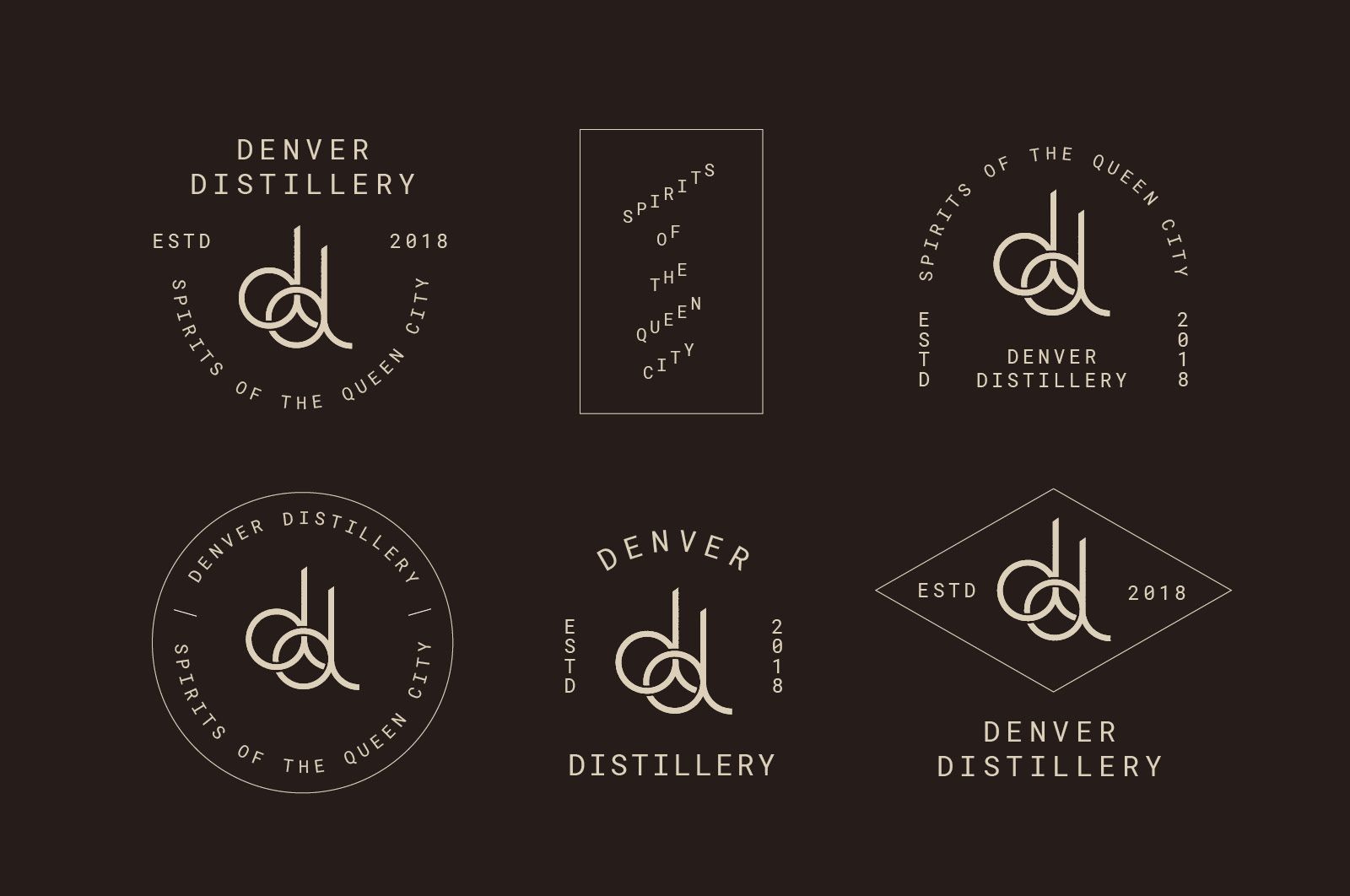
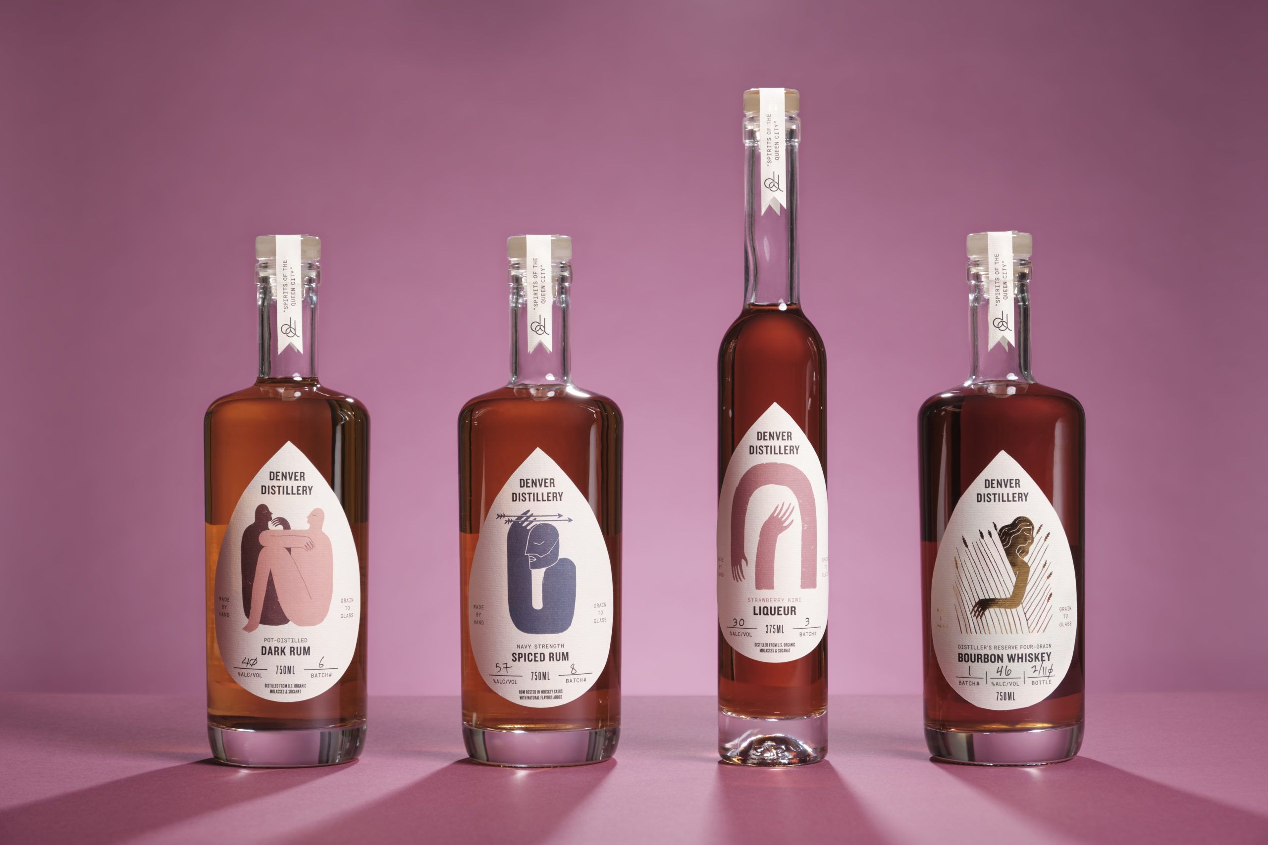
Our first task was to help reflect the value of handcrafting in their brand. We redrew their ‘overly-digitized’ logo to match a sculpted iron version that appears in the distillery.
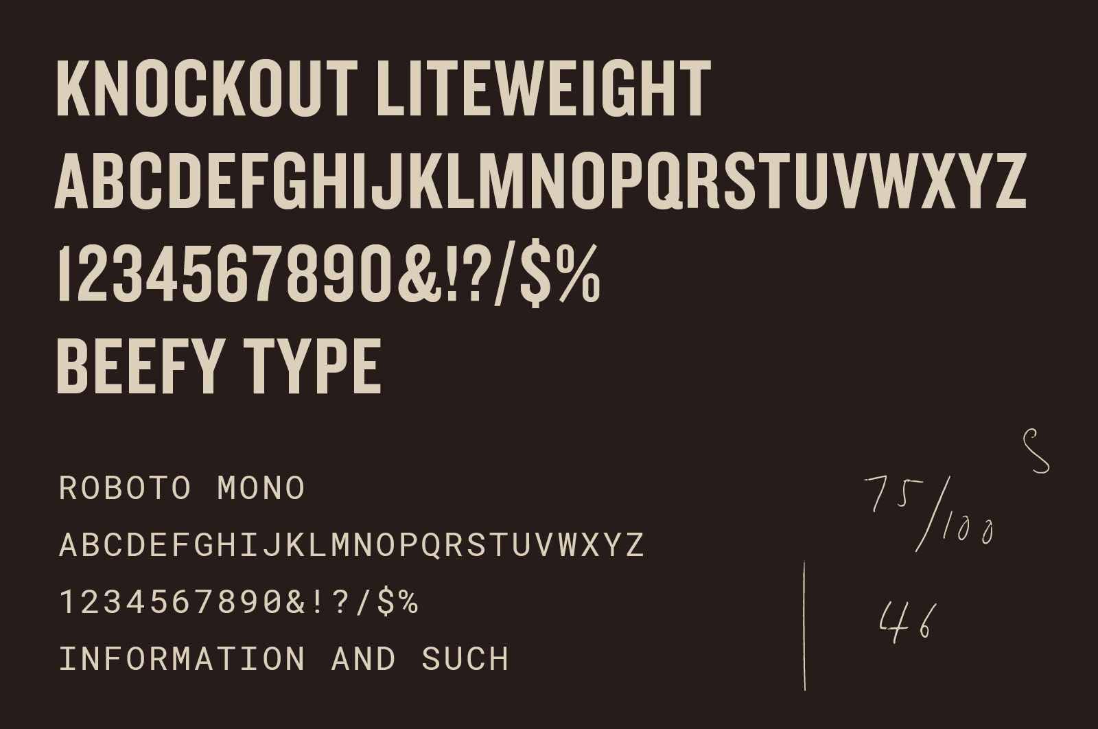
We also specified typography well suited to the distillery’s historic working-class neighborhood and designed a suite of logo lockups with an appropriate feel.
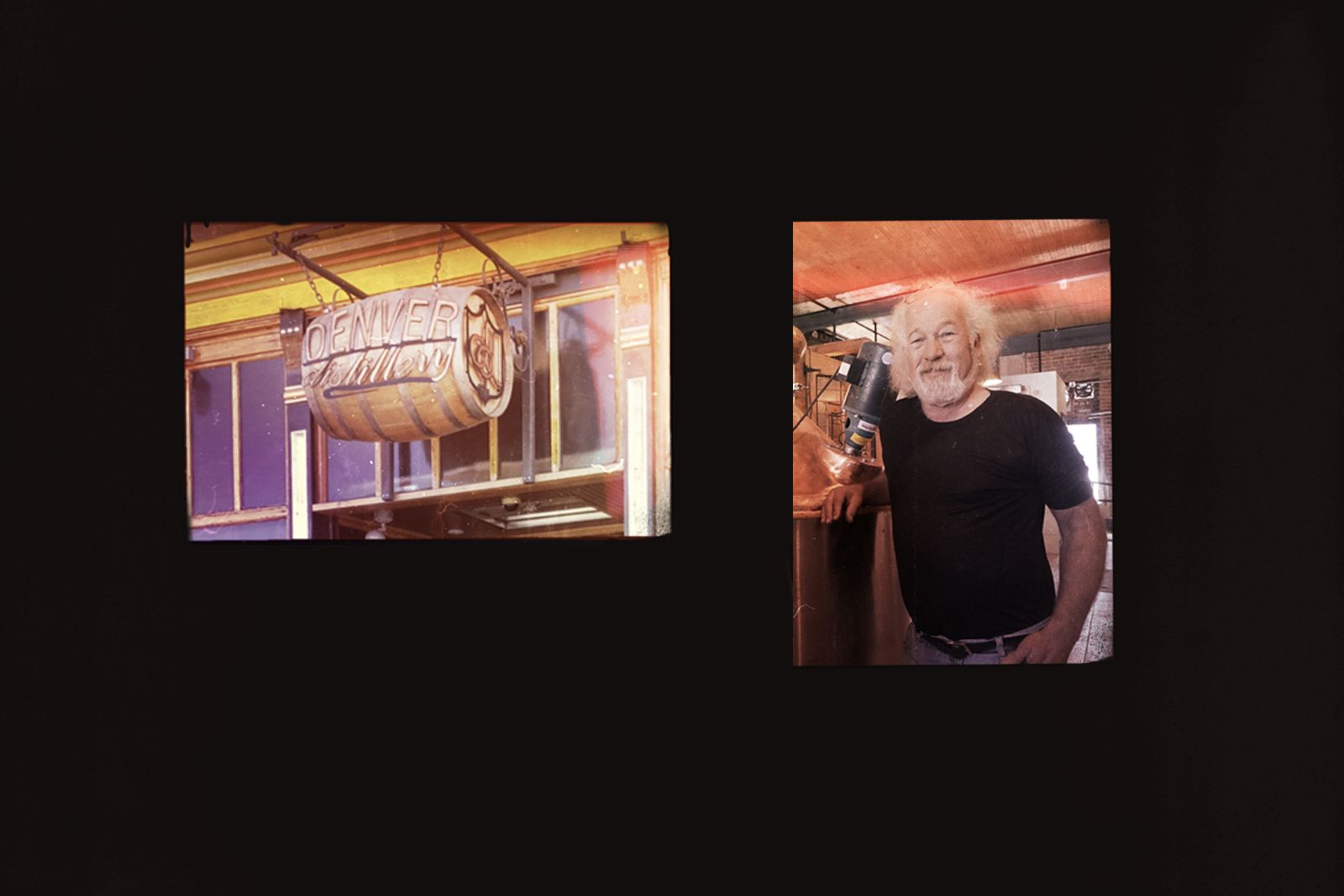
At our first chat with distillery’s charismatic owner Ron, he started the conversation with, “what’s the first verb in the Bible? Created. I was retired and could sit around, or I could start this distillery—an act of creation.”
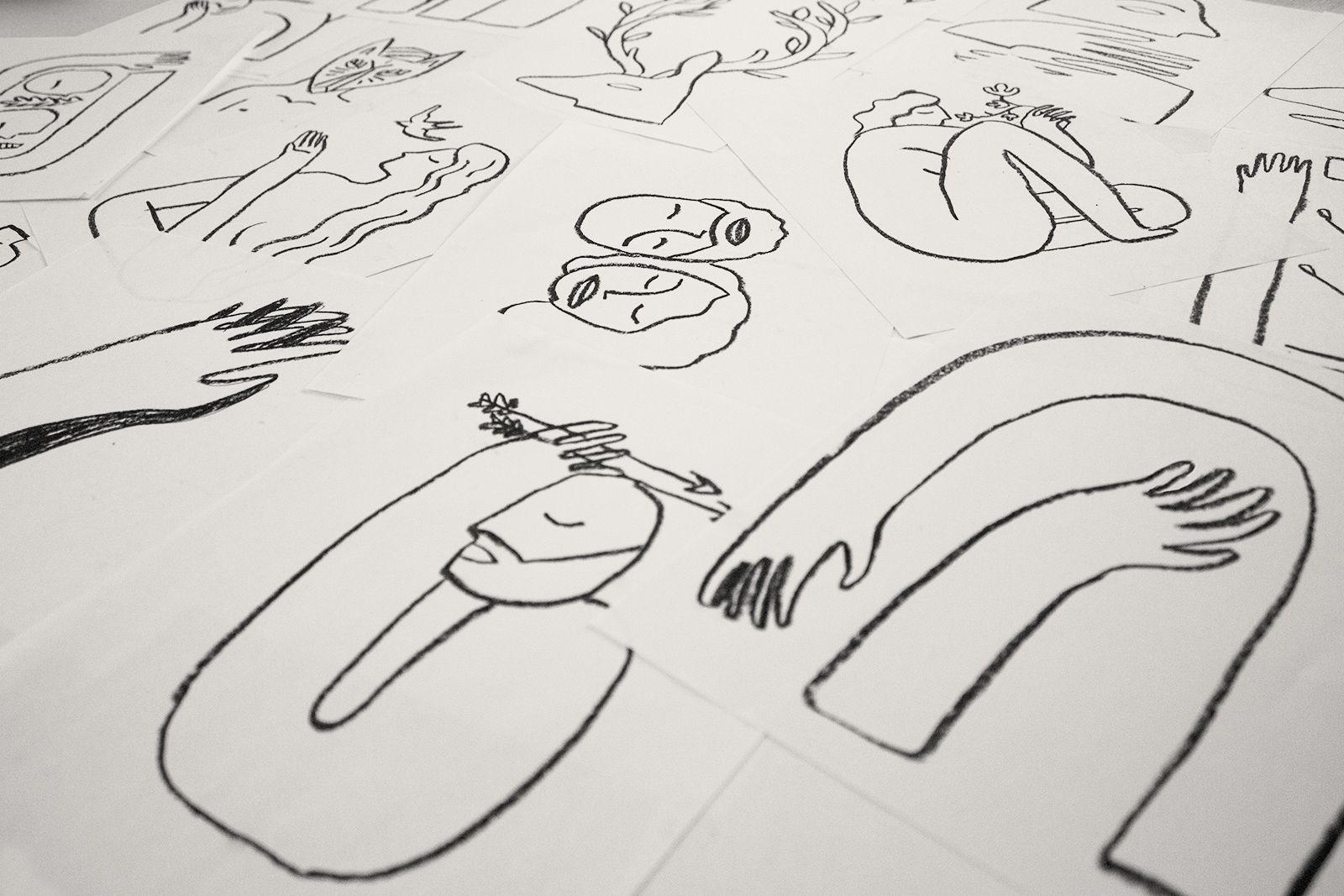
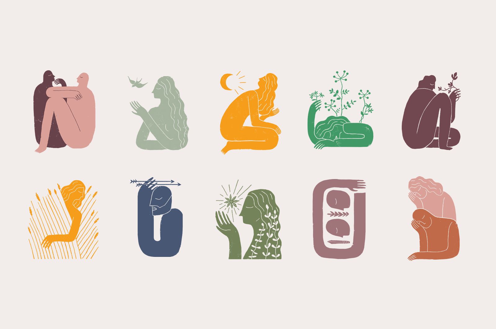
It was in this spirit that we created the concept behind their packaging. Ron and his team are deeply interested in the stories and art that define the human condition and experience. We drew a multitude of illustrations based in lore and legends.
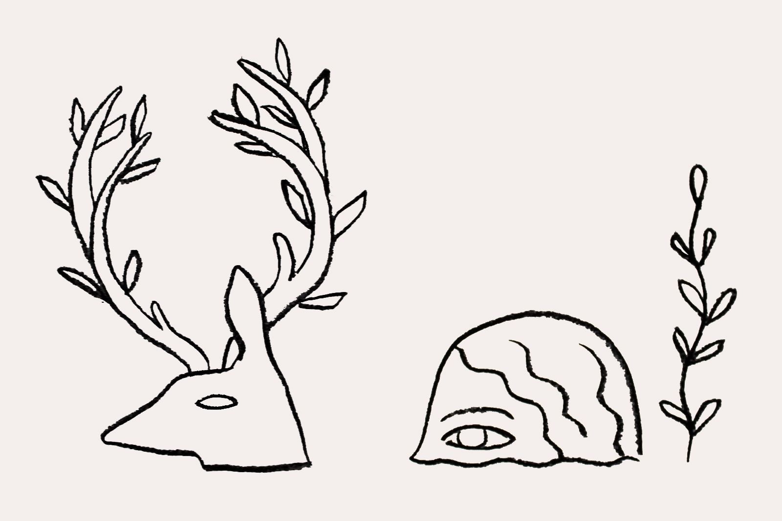
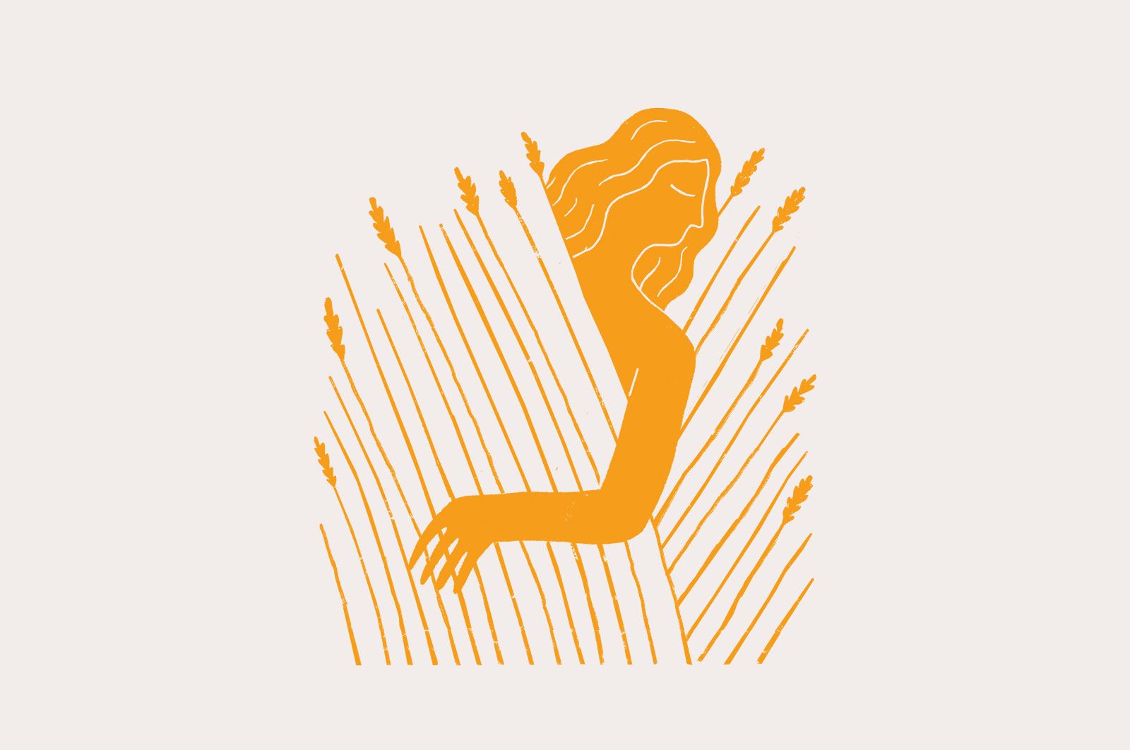
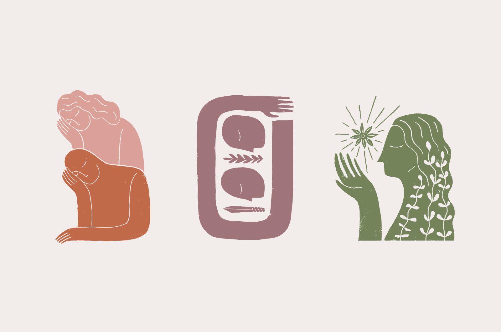
With help from the distillery’s marketing manager Jen (who happens to be an art history aficionado), we selected art to pair with each spirit.
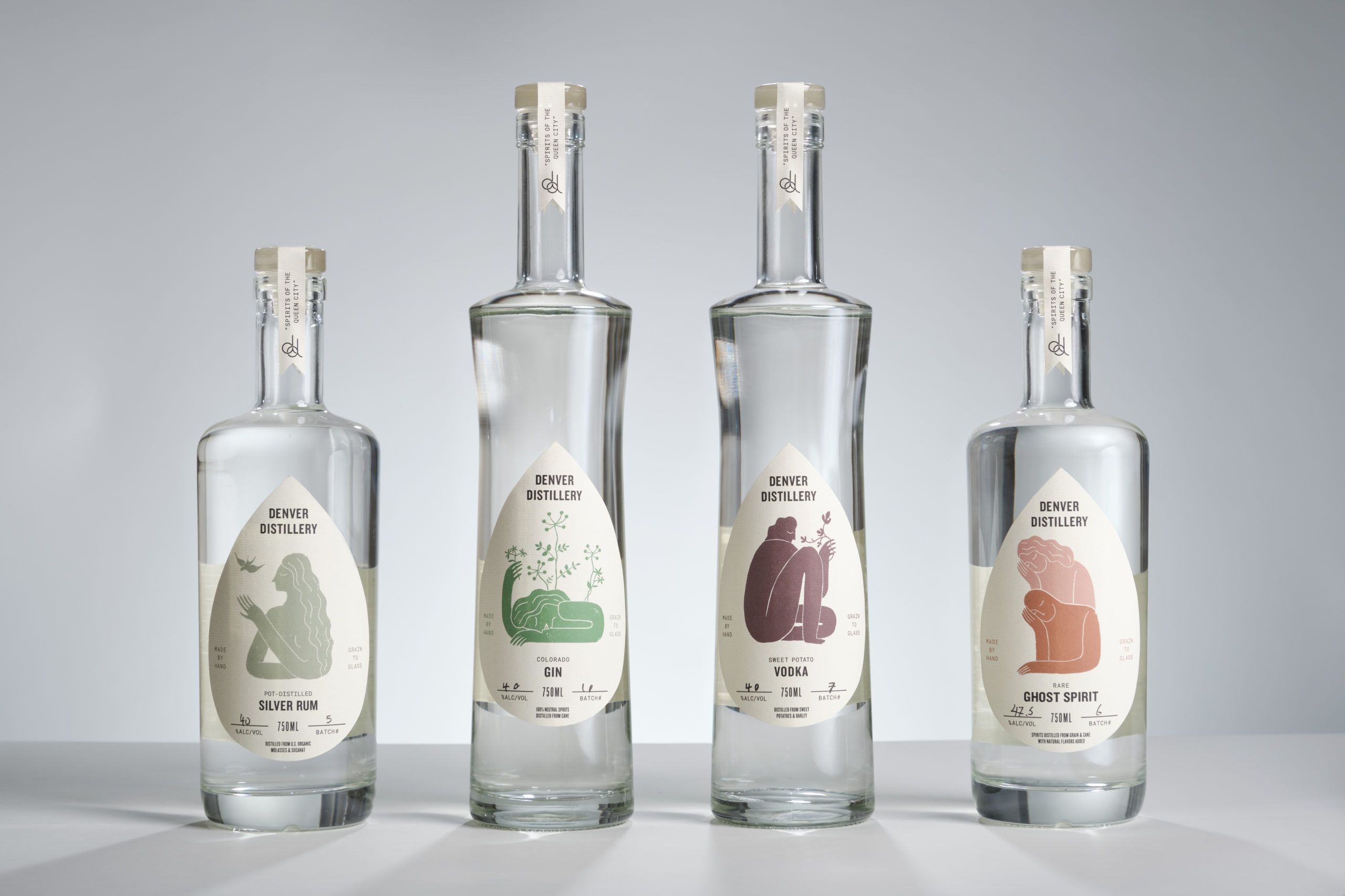
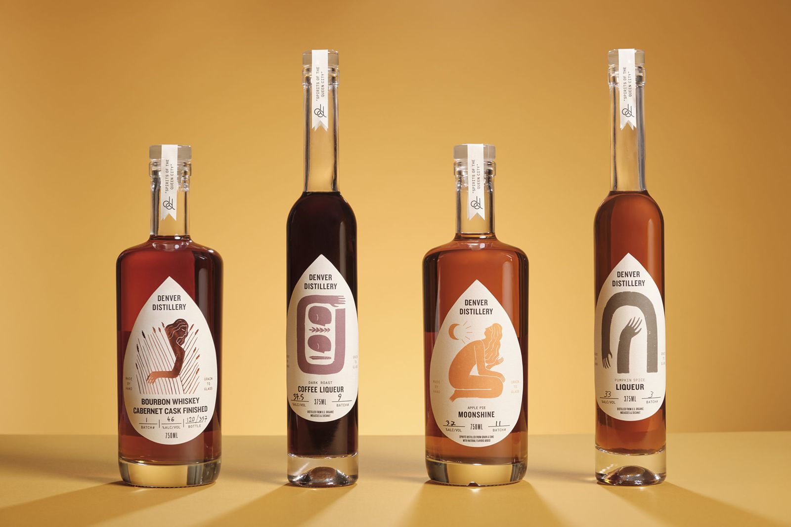
Then, the bottles. Variety is the spice of life but can make branding tricky. The distillery employs three different bottle shapes and produces over a dozen unique spirits, from sweet potato vodka to moonshine and small-batch bourbon. We helped the distillery organize their product hierarchy to pave the way for a unifying brand structure.
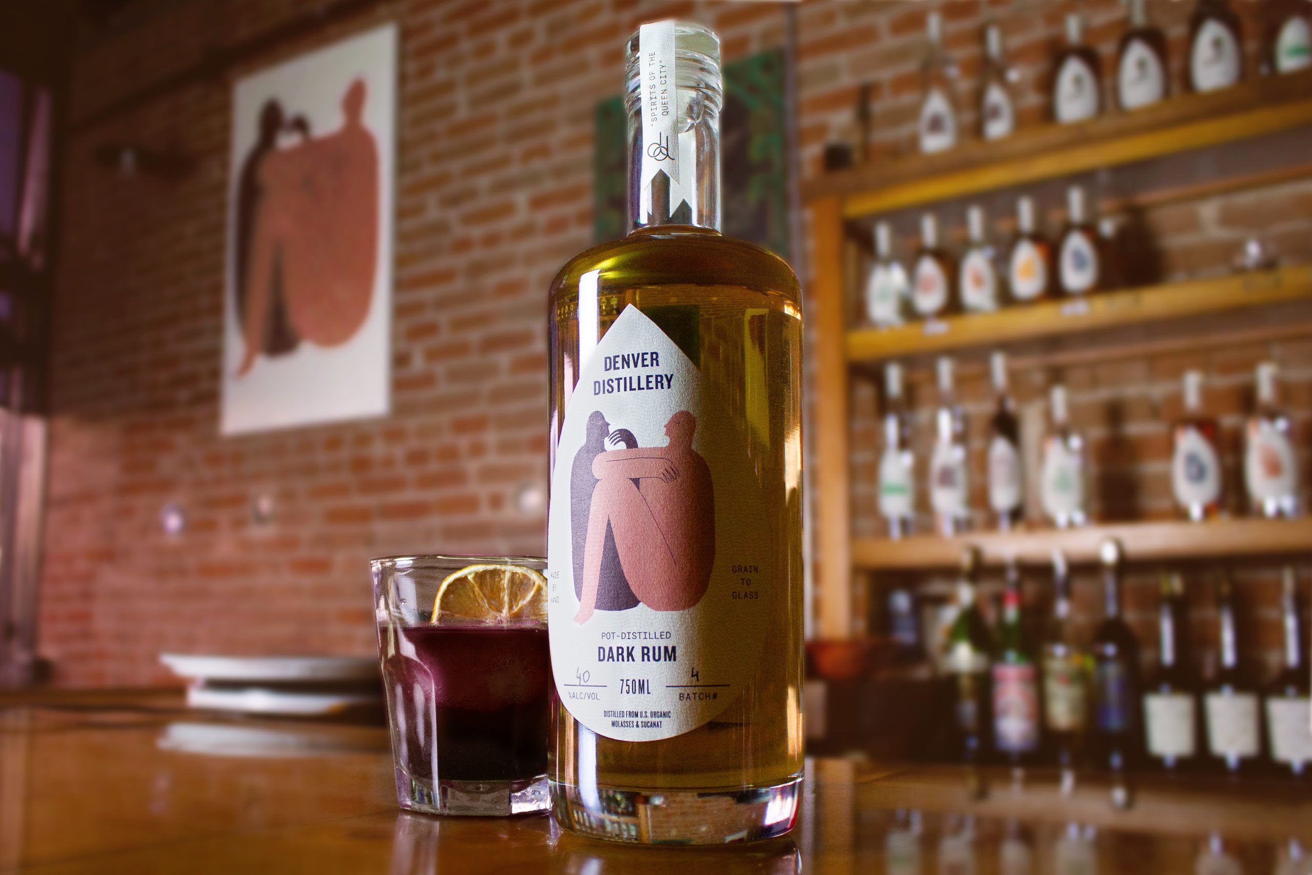
To visually unify these products, we developed a unique layout and die-cut teardrop label shape. The teardrop—and the bit cut from the top label strip—add a consistent and familiar shape across the entire range, while also sitting flatter on the concave bottle shapes. They came together with the artwork to finally give Denver Distillery a visual sense of bravado and quality reflected in their spirits.
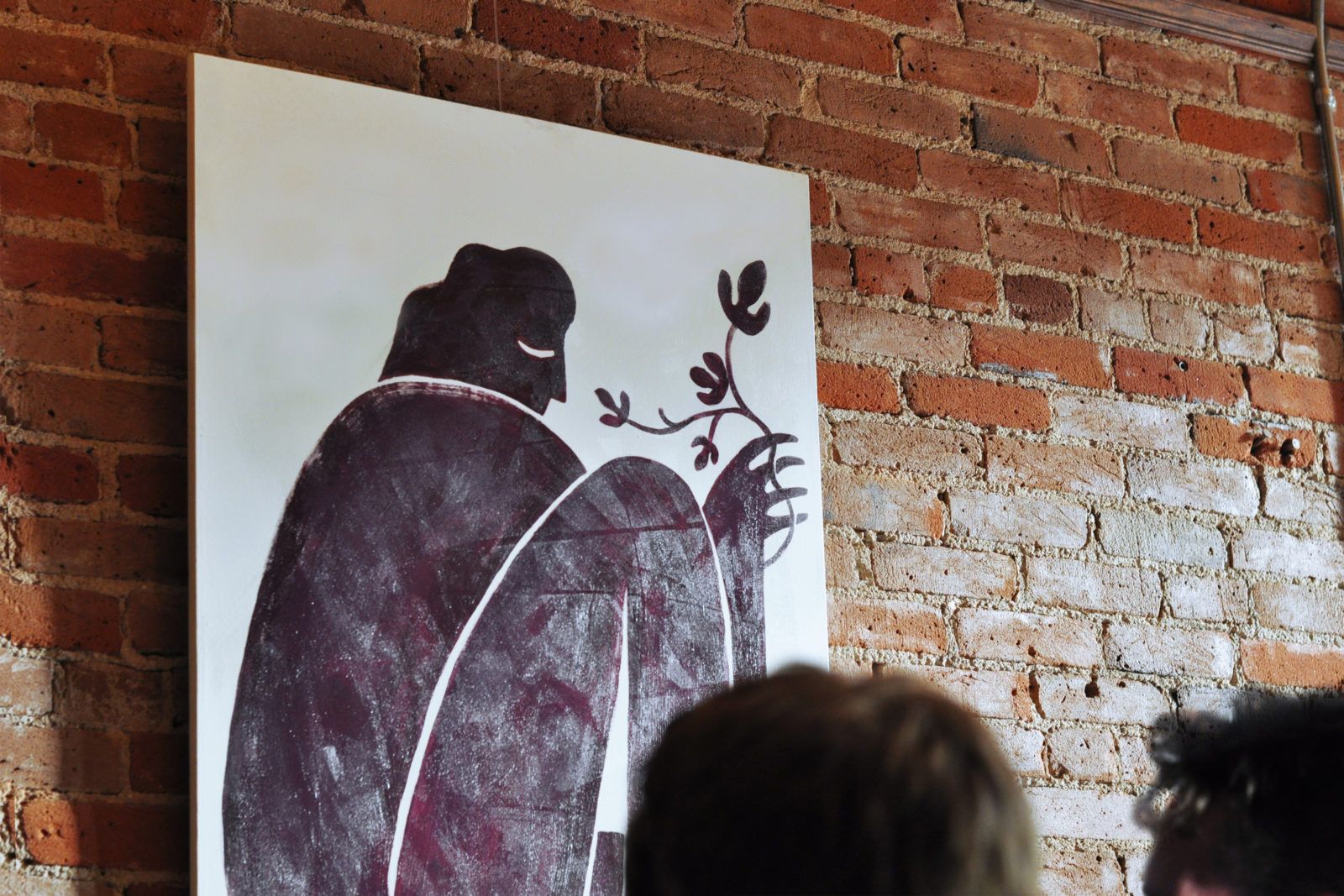
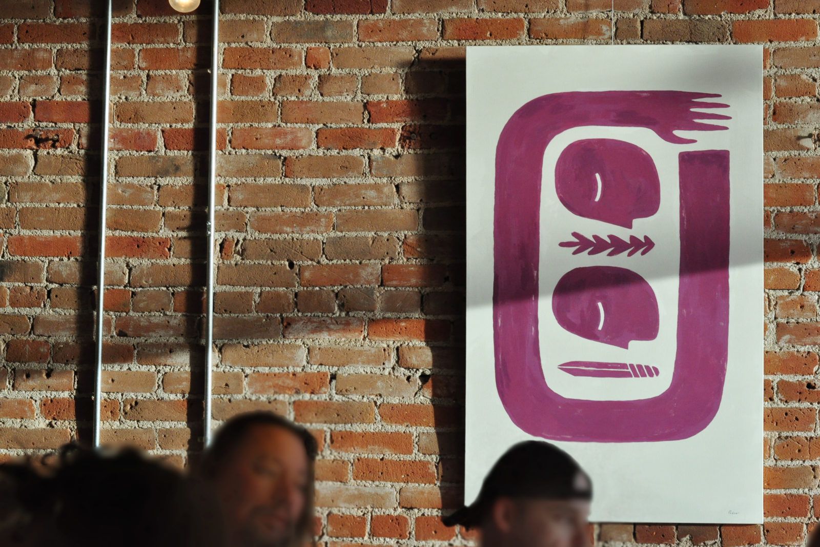
To cap it all, we painted a few favorites on canvases to hang in the distillery. When a patron orders a sweet potato vodka martini or silver rum cocktail, they can salute the character from the bottle with a toast. If you find yourself in America’s Queen City, pop by the distillery on South Broadway and do the same.
“Working with O Street was like being a teenager sent to live for the summer with your quirky old relatives who live in an ancient house in a timeless valley, and you don’t initially know what to make of them but you quickly find out they actually belong to an order of magical beings who choose to use their powers solely for the purpose of creating beauty in the world.”
—Chris Anderson-Tarver, Denver Distillery