Why have just one logo?
Logos can be boring. Being stuck with one can be especially yawn-inducing. Don’t you wish we could have lots of logos to play with—get some variation in there to keep things interesting?
Most logos these days do have variations: different colour combinations; screen/print versions; animated versions; even responsive adaptations for different screen sizes. There’s also the more old-school approach of having both a logo and a logotype (think Nike, sometimes with the word and sometimes just the swoosh). This is all fine and dandy, but I’d classify all these options as variations of one logo.
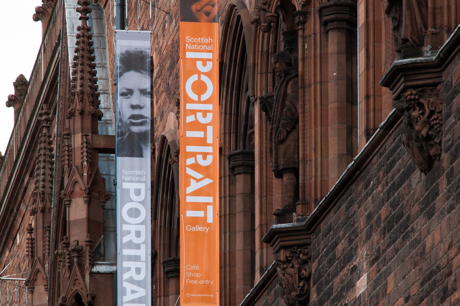
Even our fluid typographic logo for the Scottish National Portrait Gallery would likely count as one logo if you had to choose. Why do we limit ourselves? Consistency. Yeah, I get it, and I agree in most cases. With limited budgets and a saturated market, brands need elements that make them easily memorable (what marketers often call ‘strong brand recall’).
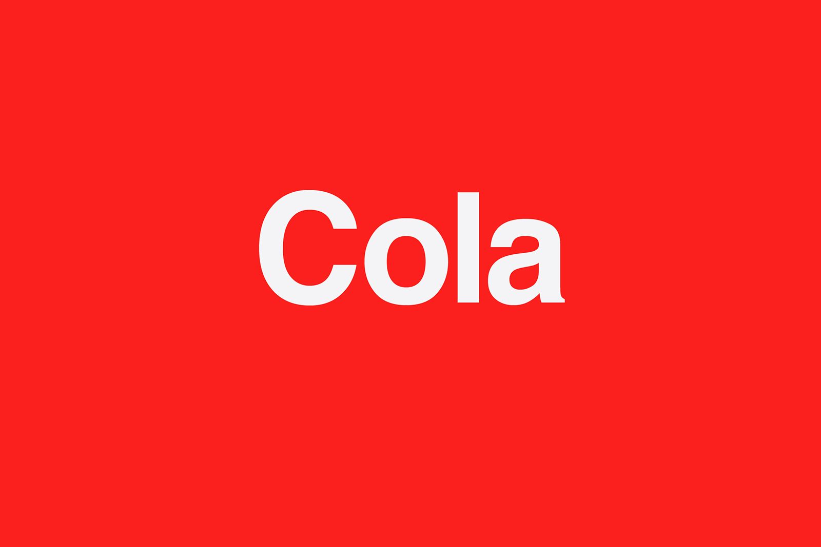
Did you need to see that old scripted logo to fill in the blank? No? That’s brand recall.
As illustrated above, we reinforce brand recall with more than logos. We establish tone of voice, colour palettes and image strategies to establish recognition even when the logo is hidden. If we have a wider colour palette, then we often lean more on the other assets for consistency. You still with me? For example, if the colours keep changing in your ads, we’d probably need to make sure the logo or type was prominent and more consistent.
If we accept that principle, then surely if everything else was pretty strong in your applications, why not mix up the logos a bit? Sound crazy? Would it ever work? …well yes, actually, it already does: look at Major League Baseball teams.
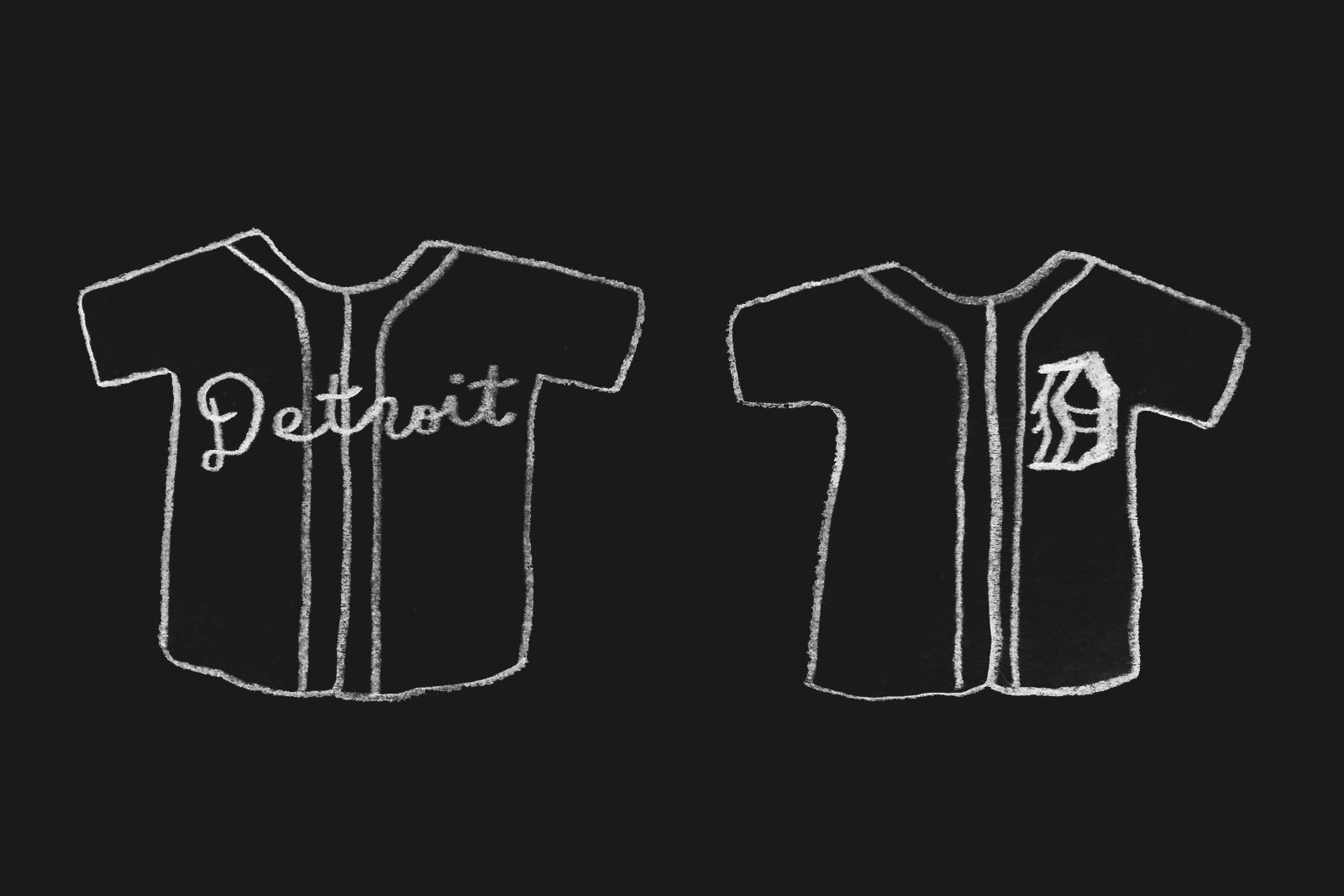
Baseball teams aren’t happy with just having one logo, and they’ve proved it with their garb for over 100 years. America’s past-time and oldest sport has a rich visual branding history. The Home team will most often just have their logo on their shirts (a blackletter ‘D’ for Detroit), but when they play away from home they’ll change that to their city name. They’ll even change the font.

They will have a cap with their initials on it when playing Away (Cleveland Indians) but roll out their cheeky (and controversial, but that’s another discussion) face marque when playing at Home. It’s obvious, really—when playing in Cleveland they don’t need to remind the fans what city they are in—why not have a bit of fun instead of using the same old logo?
Could this approach work for corporate brands? For example, do long-time employees really need the name of the company emblazoned on every page on their door entry card? How about simply their name in the brand’s typeface, or better yet, their own personal version of the corporate logo? Some brands already do this a bit in the public sphere; Google famously mix up their homepage, changing the logo to celebrate certain dates.
Packaging of course is another example, where instead of one monolith logo, we often see a range of visual identifiers, arguably, different logos. Another client O Street have worked with is Dewars, who have a logotype for Dewars and one for John Dewar & Sons Ltd; they also have a signature and even a Celtic knot.
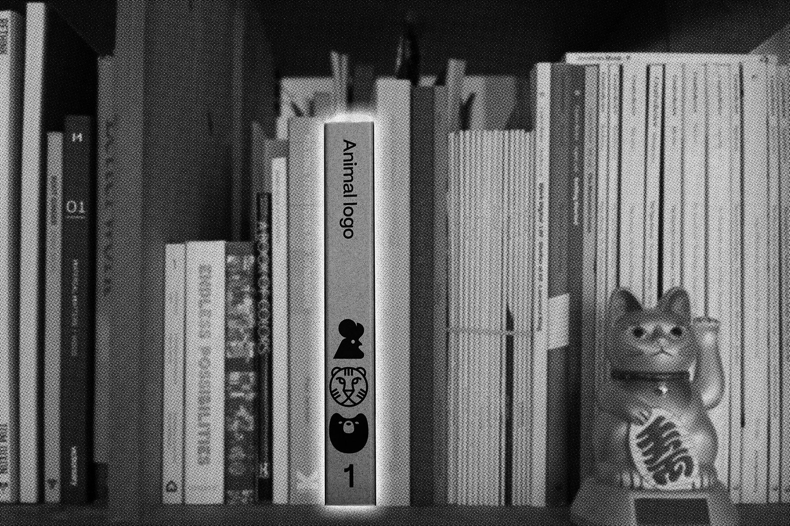
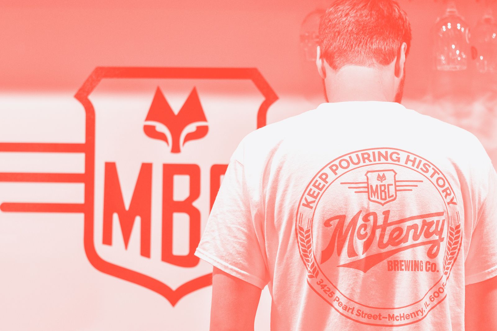
Our recent branding for McHenry Brewing Co has a bunch of different logos. It may be dangerous for a new brand, but in the context of beer we felt we had the scope to be playful. Okay, we’d been watching a lot of baseball, but with tight control of the core brand red-orange colour we felt we were in safe territory to maintain consistency, too.


I guess this comes back to a common theme in our work at O Street: questioning established norms. Do we really need to do it that way because everyone else does it that way, or should we focus on what that particular brand needs to achieve first and come up with a new way of delivering that? Also, do we need to be that precious with the brands we make? Can a bit of variation actually help add personality without damaging the brand?
We’re looking to find out. Are you?